Ever stared at a blank wall, unsure of how to breathe life into it with art? The answer might lie in a simple yet transformative principle known as the 2/3 rule. This insightful guideline helps shape your decorating decisions, ensuring a balanced and visually satisfying arrangement.
It suggests that wall art should cover about two-thirds of the available space, or the space above a piece of furniture. This approach not only enhances the visual flow but also helps in making the wall or room look cohesive without overwhelming the senses.
Let’s dive deeper to explore how this rule can assist you in picking the right pieces and how it can be implemented to maximize effect, creating an inviting and enchanting atmosphere in your living space.
- Understanding the 2/3 Rule
- Choosing the Right Art Pieces
- Applying the Rule Above Furniture
- Creative Tips for Wall Arrangements
- Avoiding Common Mistakes
Understanding the 2/3 Rule
The concept of the 2/3 Rule serves as a beacon for anyone navigating the sometimes overwhelming path of home decor. Rooted in basic design principles, this guideline states that when selecting wall art for a space, whether it be a stretch of open wall or the area above a significant piece of furniture like a couch or a sideboard, the artwork should cover about two-thirds of that space. This helps establish a balance where the art neither overpowers nor gets lost in the room's overall aesthetic. This balance is crucial, creating harmony between art and furniture, which are both essential components of interior design.
The popularity of the 2/3 Rule as a decorating mantra can be attributed to its practicality. Designers have long relied upon this guideline to ensure a visually pleasing composition that feels effortless and natural. It's akin to the Rule of Thirds in photography, which guides photographers to place the most critical elements along the imaginary lines that divide a scene into thirds. Similarly, decorating with the 2/3 Rule helps to avoid the unsettling feeling that comes with art that looks mismatched or awkwardly placed.
Interior designer Jennifer Adams once said, "Simplicity carried to an extreme becomes elegance," a truth that resonates well with the essence of the 2/3 Rule.
Anatomy of the 2/3 Rule
At the heart of the 2/3 Rule in decorating lies its measurement process, often less scientific than intuitive. To effectively utilize this rule, begin by measuring the width of the furniture piece over which the artwork will be placed. For instance, if you have a sofa that is 9 feet wide, the ideal width for your artwork grouping should be around 6 feet. When applied correctly, this measurement becomes a strategic advantage, turning potentially empty walls into accents that anchor the room's theme and design intent. This approach also prevents the art from spanning too wide or appearing overcrowded, each a common pitfall in interior decoration.The Psychological Impact
The 2/3 Rule does more than just guide the dimensions and positioning of wall art; it also has a profound psychological impact. This aesthetic decision can influence how we perceive a room, offering feelings of warmth and cohesion. Studies in spatial psychology suggest that balanced environments can positively affect our mood and mental state, making spaces feel open, organized, and inviting. Utilizing the 2/3 Rule, thus, is not simply about aesthetics, but about creating a space that offers peace and inspiration. In today's fast-paced world, this type of ambience can be incredibly valuable, turning a house into a sanctuary where one can unwind.So, next time you contemplate the bare space above your sofa or dining table, consider tapping into the subtle wisdom of the 2/3 Rule. By doing so, you'll be adopting a strategy that not only elevates the art itself but also enhances your whole living space, bringing your decor aspirations to life with elegance and ease.
Choosing the Right Art Pieces
Selecting the ideal wall art for your space involves more than just picking pieces that catch your eye. It's essential to consider the harmony between the art, the room's motif, and the overall atmosphere you aim to cultivate. Start by asking yourself what story or feeling you want each piece to communicate. Wall art can evoke different emotions and it's important that the pieces you choose align with the intentions you have for the room. Whether seeking to evoke tranquility or energy, every piece should contribute meaningfully to the space.
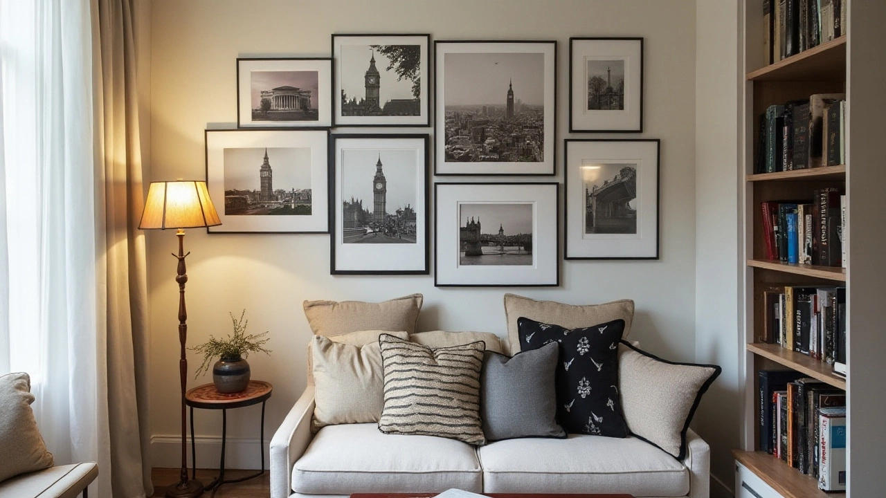
Size is a critical factor here. Aim for art pieces that don't just look good on their own but work well together under the 2/3 rule. The pieces should collectively fill two-thirds of the wall space or the span above your furniture without overwhelming it. A common technique involves creating a gallery wall, where a collection of smaller pieces collectively maintains the balance while allowing for a dynamic visual experience. Consider mixing different sizes but maintaining a consistent frame style or color palette for a coherent look.
Color plays a profound role too in selecting the right art pieces. Think of the room's existing color palette and choose art that either complements or boldly contrasts in a way that seems intentional. For instance, if your room is dominated by cool tones, warm-colored artwork can provide a stunning contrast. Conversely, echoing subtle hues from your furnishings in your wall art can yield a serene, tidy aesthetic. Additionally, when opting for a color contrast, ensure it doesn't clash with the room decor, maintaining a coherent visual story.
Artwork Themes and Styles
The theme or style of the artwork is just as vital. Abstract pieces might fit well in a modern or minimalist setting, creating a focal point of interest. Conversely, traditional art can blend seamlessly into a classic or antique setup, lending an understated elegance. It's about finding the right balance where the art style enhances, rather than sabotages, the ambience of the room. If in doubt, consider consulting art guides or stylists for valuable insights into thematic cohesion.
"Art is not freedom from discipline, but disciplined freedom." – John F. Kennedy
Your choice should, at times, also reflect your personal interests or the art's connection to you. Having a personal connection to at least some of the pieces ensures that your living space feels authentic and uniquely yours. When visitors ask about them, a backstory can bring an additional layer of engagement and depth to the conversation, turning your decorated wall into a gallery of narratives.
Applying the Rule Above Furniture
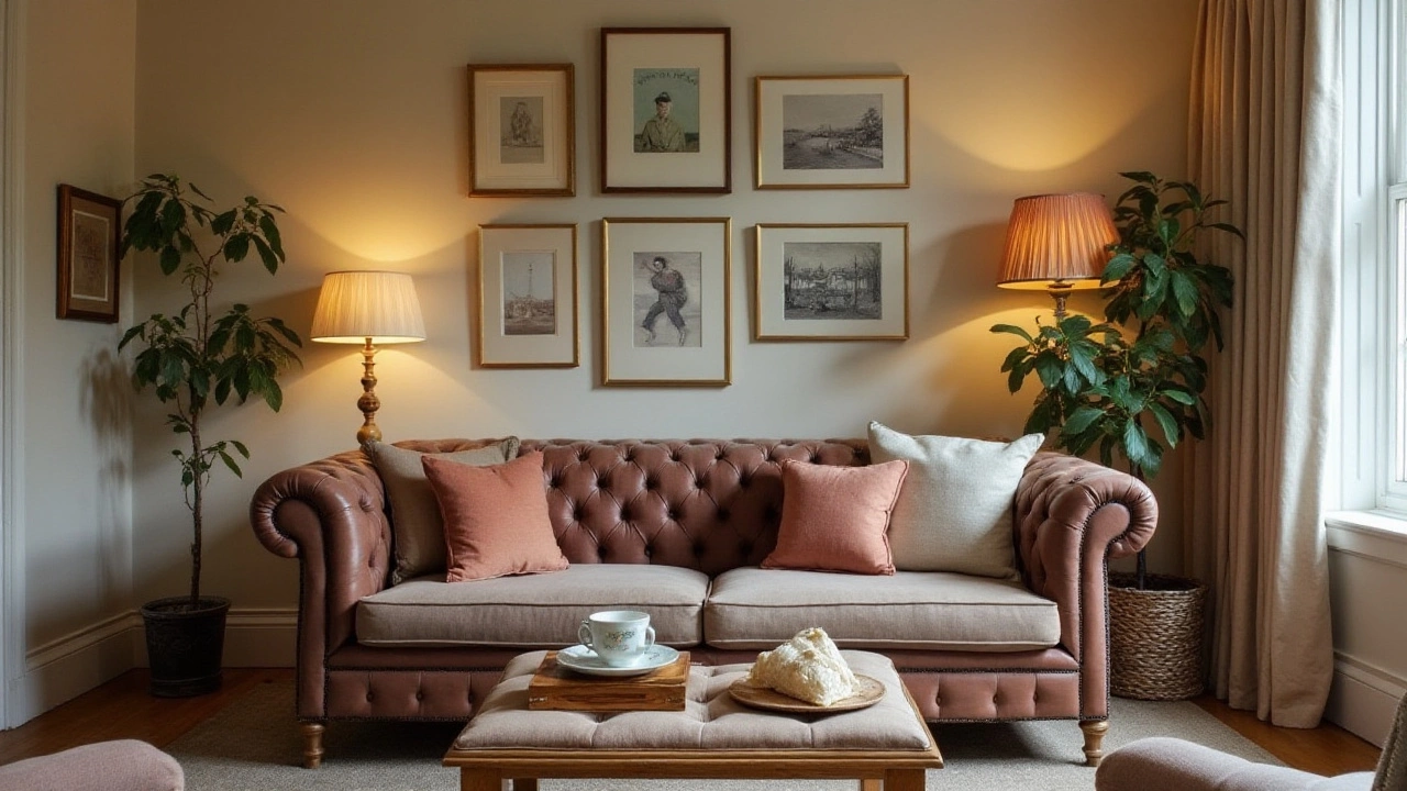
When it comes to decorating the space above your furniture with wall art, the 2/3 rule emerges as a game-changer in achieving visual harmony. Picture a freshly painted room where the art sits above a sofa or a sideboard. The magic happens when your chosen pieces fill approximately two-thirds of the available horizontal space. This technique helps in avoiding that ‘floating on the wall’ look that can leave a space feeling disjointed.
Consider, for instance, a standard couch that stretches six feet along a wall. Applying the 2/3 rule means your artwork should span about four feet in width. A well-aligned collection, whether it's a single statement piece or a series of smaller frames, creates a sense of continuity. Designers suggest anchoring the bottom of your art roughly six to eight inches above the furniture. This aligns it with the human line of sight and makes it a conversation starter among guests.
For those who adore multi-piece setups, the 2/3 rule is indispensable. Lay out your pieces on the floor to experiment before hanging them on the wall. Ensure the total arrangement respects that two-thirds width guideline. This practice not only saves you from drilling unnecessary holes but lets you tweak your design until it feels just right. "Art completes a room the same way icing decorates a cake; it demands careful placement," notes interior designer Sheila Bridges, whose savvy advice has been featured in many publications.
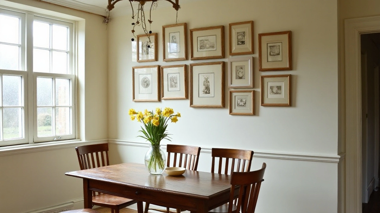
When tackling spaces like dining rooms, where large tables may dominate, the 2/3 rule can turn potential chaos into an elegant setting. Balance is crucial to prevent the overwhelm that can stem from mismatched proportions. Often, homeowners mistake bigger for better, but a calculated approach ensures that artwork complements rather than competes with the shapes and sizes of the furniture below.
Of course, practical implementation requires keen eye coordination with other visual elements in play, such as lighting and paint color. Bright or oversized pieces placed above could necessitate softer lighting, ensuring that the art is neither too harshly lit nor lost in shadows. Delicate ivory or cream walls, when paired with a bold abstract art piece in the abiding space above a muted-toned credenza, can illuminate understated elegance.
Enthusiasts might find themselves questioning if they should mix frame styles or stick to a single style. The answer lies in the room's tone; eclectic frames can add character to a themed room but might clash in a minimalist setting. Always remember to factor in personal taste. This is your space after all, a reflection of what you hold dear.
A practical way to gauge satisfaction is to live with the layouts for a few days before finalizing. Stepping into the room over consecutive mornings with fresh eyes can provide surprising insight on what serves your space best. Such careful consideration ensures that when company arrives, they are captivated by the cohesive charm of your decorated wall, seamlessly unified by the 2/3 rule.
Creative Tips for Wall Arrangements
Achieving a beautiful wall arrangement using the 2/3 rule isn't just about measuring spaces and hanging art; it involves tapping into your creativity and knowing what combinations resonate the best. One versatile approach is to play around with wall art sets. When curated thoughtfully, art sets can transform a dull wall into a storytelling canvas. Group items of varying sizes together. It introduces a dynamic flair that often catches the eye. Think about different forms of art—mix paintings with photography or intricate sketches with vibrant canvases. Adding a small mirror into the mix not only adds depth but can reflect natural light, making your room brighter and more open.
For a truly personalized vibe, create a gallery wall. Select pieces that speak to your personality or tell your story. You can take a minimalist approach, using frames in monochrome shades to keep it cohesive, or be adventurous with different colors and materials. Remember to stick to the decorating tips and ensure that the collective width of your artwork spans around two-thirds of the wall's width or the furniture beneath it, as this maintains balance and focus. According to interior design expert Nate Berkus, "The key to a striking gallery wall is to think of it as a shape—an outlined form that holds everything together."
Patterns and themes can be a game-changer. If you're drawn to landscapes, consider a sequence of panoramic shots or painted vistas to draw in the eye with a natural rhythm. Mixing abstract and figurative pieces? Look for tonal continuity; similar color schemes create harmony across varied styles. Home decor frequently gets a boost from thematic consistency, even if that theme is a subtle undertone like 'urban cool' or 'rustic charm.' Dare to mix in some unexpected pieces—antique trinkets or children's art—not all that decor needs to be expensive or from renowned artists to make a meaningful impact.
Height variation is another ingenious way to add interest. Play with the heights from where each piece is hung. Not all art has to be centered at eye level. Some pieces can sit higher, some lower, inviting viewers to explore the entire wall. This type of arrangement creates an inviting allure and makes the entire wall a conversation starter. And if you're feeling experimental, consider suspending art from the ceiling with thin wires for a modern, whimsical hanging look.
Lastly, involve different textures to achieve a multidimensional feel. Artwork isn't limited to frame-and-canvas only; textiles can be part of the game, too. Tapestry or macramé can introduce warmth and a bohemian touch. A mix of fabric art paired with framed prints can turn any wall into a tactile and visual delight. Experimentation is key, and breaking a few traditional rules might just be what gives your wall its unique charm.
Avoiding Common Mistakes
Adorning walls with wall art brings forth an undeniable beauty but only when done right. Even the most exquisite pieces can fall flat if common pitfalls aren't carefully sidestepped. One major blunder is disregarding the size and scale of the art relative to the wall or furniture. When pieces are too small, they can get lost, while overly large ones dominate the space uncomfortably. To avoid this, it is crucial to measure accurately and consider each room's specific dimensions before making any purchases. The 2/3 rule is not just an aesthetic suggestion; it's practically a measuring tape for your eyes and senses. When aligned properly, decorating tips like these enable art to complement the home seamlessly.
Ignoring the intended vibe or theme of a room may also lead to mismatched decor. Art should resonate with the room's function, whether it's tranquility for a bedroom or vibrancy for a living room. Selecting pieces without contemplating their potential harmony with existing elements can result in decor that feels haphazard. Striving for a theme or repeating colors and patterns enhances cohesion. The color palette should be in harmony with your furniture and accessories, creating a smooth visual journey across the room.
Another misstep can be the improper hanging of art pieces. Too often, individuals hang art at heights that do not consider the viewer’s perspective, often placing it either too high or too low. The center of the art should ideally be at eye level for the average person, about 57 to 60 inches from the floor. This placement ensures that the artwork is both detracting and relatable, making it accessible and engaging for viewers. Keeping art off-centered or awkwardly spaced is also a folly that can disrupt an otherwise balanced arrangement.
"Art is not what you see but what you make others see." —Edgar DegasThis quote profoundly highlights the importance of presenting art in a way that evokes emotion and connection. Disorganized or cluttered displays may prevent people from truly appreciating the art, as the chaos often befuddles the mind.
When arranging a gallery wall, a meticulous approach is vital. Each piece should have room to breathe, with equal margins between frames, allowing the collective display to shine. A balanced collection can invite viewers to linger and explore, discovering the stories each piece narrates. A helpful strategy involves laying the arrangement out on the floor beforehand, granting an opportunity to visually assess and adjust before making any permanent commitments on the wall.
Finally, failure to factor in home decor lighting is another error that can dampen the allure of your artwork. Art pieces invariably look their best when adequately lit, accentuating nuances and details that might otherwise remain unnoticed. Incorporate both artificial lighting and natural daylight to create effective lighting solutions, making your art appear vivid and lively. Designers suggest that lighting should be positioned to cover the entire piece evenly, without causing glaring reflections or shadows.
