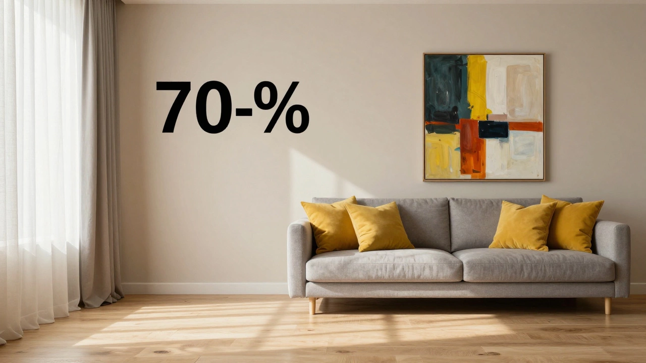
70-30 Rule Visualizer
Perfect! This is the ideal 70-30 balance for a cohesive room.
You’ve probably heard that a room needs a "pop" of color, but how much is too much? You might have seen designers talking about ratios like 60-30-10, but what about the 70-30 rule? It’s a simpler, more forgiving way to keep your space looking intentional rather than chaotic. If you’re staring at a blank wall or feeling overwhelmed by furniture choices, this ratio gives you a clear framework to follow without needing a degree in design.
The core idea is straightforward: let one dominant element take up 70% of the visual space, and use a secondary element for the remaining 30%. This isn’t just about paint colors; it applies to textures, patterns, and even the placement of wall art. When you get the balance right, your room feels cohesive. Get it wrong, and it feels disjointed.
The Core Concept: Dominance vs. Support
In any given room, the eye needs a place to rest. The 70% portion acts as the anchor. It sets the mood and defines the base of the space. Think of it as the stage background. The 30% portion is the actor-it draws attention, adds interest, and creates contrast. Without the 70%, the 30% has no context. Without the 30%, the 70% can feel boring or flat.
This rule works because human brains prefer order. We naturally look for patterns and hierarchies. When a room is split evenly-50% beige walls, 50% blue sofa-it creates visual tension. Nothing leads the eye. The 70-30 split establishes a clear hierarchy. One element says, "I am the foundation," while the other says, "I am the highlight."
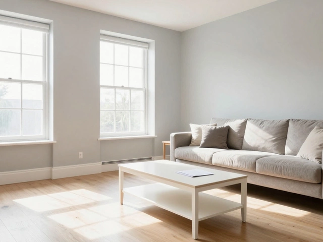
For example, if your walls are white (70%), your large area rug and curtains might be a soft gray (part of the 70% group visually), and your throw pillows, lamps, and wall art provide the 30% accent. Or, perhaps the entire room is painted a deep navy (70%), and the trim, ceiling, and light fixtures are crisp white (30%). Both work, provided the visual weight is distributed correctly.
Applying the 70-30 Rule to Wall Art
Since you’re likely interested in how this affects your decor choices, let’s talk specifically about wall art. Many people make the mistake of treating art as an afterthought, hanging a small print on a massive wall. This violates the balance principle. The art itself doesn’t have to be 70% of the wall, but its presence must relate to the room’s overall ratio.
If your room follows a neutral palette where the walls, floor, and major furniture comprise the 70% "quiet" zone, your wall art should fall into the 30% "active" zone. This means the art should be bold enough to command attention but not so overwhelming that it fights with other elements.
- Scale matters: A tiny painting on a large wall disrupts the flow. Aim for art that is roughly two-thirds the width of your main furniture piece (like a sofa). This keeps it within the supportive 30% role.
- Color pulling: Pick colors for your art from the smaller accents in the room. If your 30% includes mustard yellow cushions, choose art that features similar tones. This ties the 30% together.
- Groupings: If you prefer gallery walls, treat the entire collection as one unit. That whole grid should occupy the appropriate visual weight relative to the empty wall space around it.
Conversely, if you have a very dramatic piece of art-a large oil painting or a textured tapestry-that becomes part of the 70% anchor. In this case, the rest of the room should be subdued. Keep the walls neutral and the furniture simple. Let the art do the heavy lifting. Trying to pair a massive, colorful mural with equally busy wallpaper and patterned rugs will overwhelm the senses.

Color and Texture: Beyond Just Paint
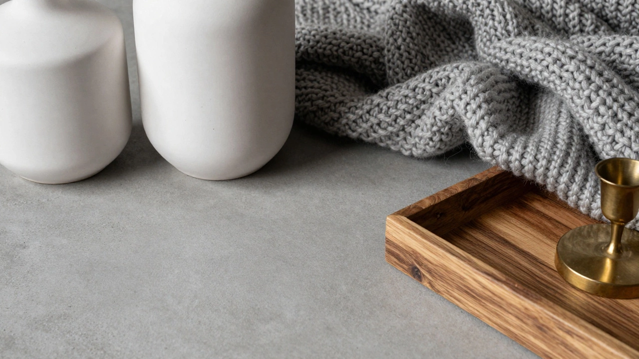
The 70-30 rule isn’t limited to color swatches. It applies heavily to texture and material. This is often where rooms fail to look "expensive" or polished. If 70% of your room is smooth surfaces (painted walls, hardwood floors, glass tables) and 30% is also smooth, the space feels cold.
Instead, use the ratio to balance tactile experiences. Let 70% of the room be hard, sleek, or matte. Then, introduce 30% of soft, rough, or reflective textures. This could mean a plush velvet sofa (soft) against a concrete floor (hard), or linen curtains (textured) against smooth plaster walls (flat).
Consider the lighting as well. Hard lighting (direct beams) versus soft lighting (diffused glows) follows this rule. Too many harsh spots create glare. Too many dim lamps make navigation difficult. A mix ensures comfort.
Common Mistakes to Avoid
Even with a simple rule, it’s easy to trip up. Here are the most frequent errors I see when helping friends style their homes in Auckland:
- Miscalculating Visual Weight: Dark colors weigh more than light ones. A black chair takes up more "visual space" than a white chair of the same size. If your walls are dark (70%), your furniture should be lighter to maintain balance, or you risk making the room feel claustrophobic.
- Ignoring the Ceiling: The ceiling is part of the 70%. Painting it a bright color changes the entire ratio. Unless you want a tent-like effect, keep ceilings neutral to support the walls.
- Overcrowding the 30%: Don’t try to fit all your personality into the 30% slot. If you have bright rugs, bold art, and neon lights, you’ve exceeded the limit. Choose one or two strong accents and keep the rest subtle.
- Forgetting Negative Space: Empty wall space is part of the 70%. Don’t fill every inch. Breathing room allows the 30% elements to shine.
How to Test Your Room’s Ratio
You don’t need a protractor to check your design. Use the "Squint Test." Step back from your room and squint your eyes until everything blurs. What stands out? What disappears?
If the room looks like a uniform blob, you lack contrast-your 30% is too weak. If you see jarring patches of different intensities fighting for attention, your 30% is too strong or fragmented. You want one dominant mass (the 70%) with distinct, clear highlights (the 30%).
Another trick is the "Phone Camera Test." Take a photo of your room in natural light. Look at the screen. Does one area dominate? Is there a clear focal point? Screens flatten depth, revealing imbalances that our eyes sometimes ignore in person. If the image looks cluttered, reduce the number of items in the 30% category.
Flexibility: When to Break the Rule
Rules exist to be broken, but only once you understand them. The 70-30 rule is a guideline for harmony, not a law. In eclectic or maximalist styles, you might push toward a 50-50 split intentionally to create energy. However, this requires high skill. For most homeowners aiming for a calm, inviting space, sticking close to 70-30 is safer.
You can also layer the rule. Within the 30% accent zone, apply another 70-30 split. For instance, if your 30% is "wood tones," make 70% of that wood dark walnut and 30% light oak. This adds depth without breaking the primary structure.
Is the 70-30 rule the same as the 60-30-10 rule?
They are similar but distinct. The 60-30-10 rule breaks the room into three parts: 60% dominant color, 30% secondary color, and 10% accent. The 70-30 rule simplifies this into two camps: dominant (70%) and supporting (30%). The 70-30 approach is often easier for beginners because it reduces decision fatigue. You only need to worry about two groups instead of three.
Can I use the 70-30 rule for small apartments?
Absolutely. In fact, it’s crucial for small spaces. Over-cluttering makes rooms feel smaller. By keeping 70% of the space neutral and open, you create an illusion of volume. The 30% adds character without closing off the room. Stick to light colors for the 70% to maximize brightness.
How does wall art fit into the 70-30 ratio?
Wall art usually falls into the 30% category unless it is a massive statement piece. If your walls and furniture are neutral (70%), your art should provide the color and texture contrast (30%). Ensure the size of the art relates to the furniture below it-typically 50-75% of the furniture’s width-to maintain visual balance.
What if my room has multiple focal points?
Multiple focal points can confuse the eye. Try to unify them under the 30% umbrella. For example, if you have a fireplace and a large window, ensure both share similar materials or colors so they read as one cohesive "supporting" element against the neutral walls (70%). Alternatively, choose one true focal point and downplay the others.
Does the 70-30 rule apply to outdoor spaces?
Yes. In landscaping, the 70% could be green foliage and grass, while the 30% consists of flowers, hardscaping, or furniture. This ensures your garden looks natural rather than manicured or chaotic. Balance is universal across indoor and outdoor design.