Picture this: your living room looks just right in the daylight, but once you throw on those heavy navy curtains, the sun is gone and suddenly the room feels like a cave. It’s funny how a bit of fabric changes everything. Curtains are more than window dressing—they can make a room feel bigger, cozier, lighter, or just full-blown stylish. If you get curtain color wrong, the whole room is off, no matter how expensive that sofa is. But nailing it? Instant upgrade—no paint required.
How Curtain Color Shapes Your Living Room’s Mood
Ever wonder why some rooms look fresh and open while others feel cramped and heavy? Often, it starts at the window. Curtain color plays a sneaky role in how you experience your space. Scientifically, humans are hardwired to respond to color. A 2024 study at the Swedish Color Research Institute found people rated rooms with pale blue or soft green accents as 35% more relaxing than rooms with deeper reds. So, curtain color is not just about style—it’s a mood shaper.
Lighter colors—think soft grays, ivories, sands—bounce sunlight and blur the lines between indoors and out. If your living room faces north or just battles for light, these colors are your secret weapon for making the room feel airier. Pale curtains don’t darken your corners, and they don’t steal your focus from art or bright furniture.
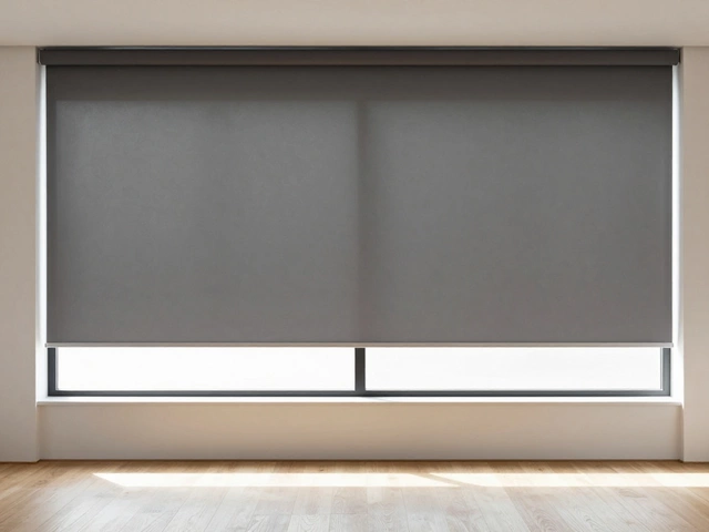
Darker curtain colors, like charcoal or emerald, are cozy and grounding. Got a huge room that feels a bit empty? Deep-colored curtains add drama and visual weight. But here’s the catch—you need enough natural light, or you risk turning ‘cozy’ into ‘closed-in.’
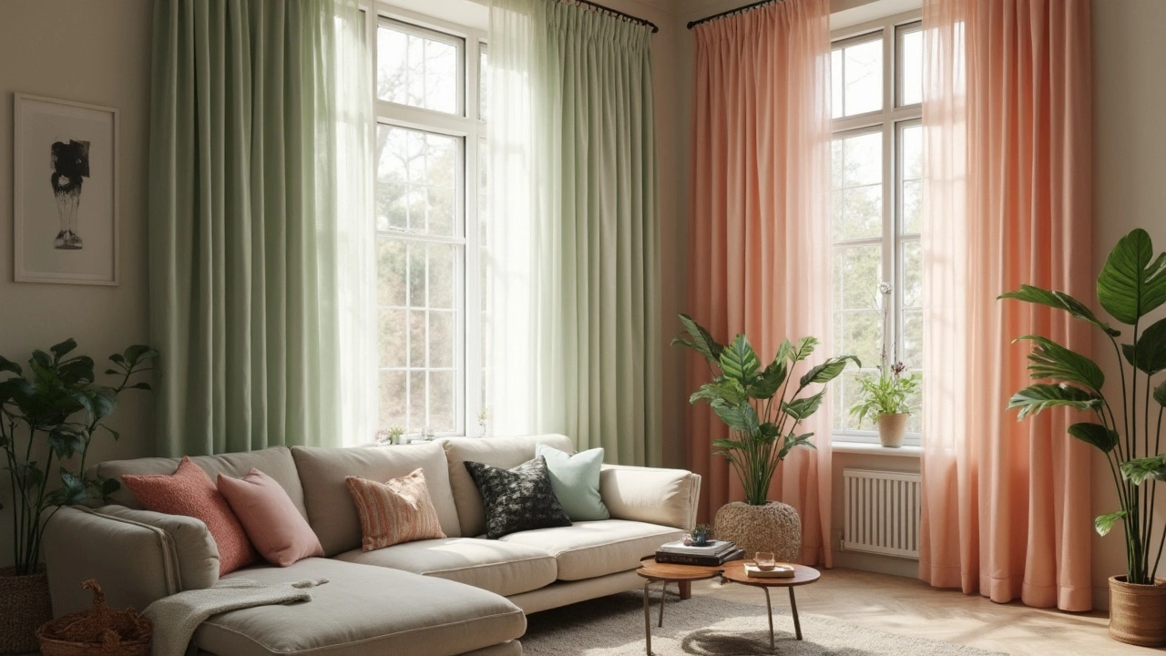
Some folks swear by bold prints or bright colors as a personality boost. It’s a commitment, for sure, but in a neutral room, jewel-toned or patterned curtains take center stage without repainting a wall. If everything else is plain, your curtains become the art.
Check out how color changes everything:
| Curtain Color | Perceived Effect | Best With |
|---|---|---|
| White/Ivory | Larger, fresher, lighter | Minimalist, Scandinavian, Coastal |
| Gray | Modern, urban, versatile | Modern, Industrial, Transitional |
| Beige/Taupe | Soft, warm, timeless | Traditional, Rustic, Farmhouse |
| Navy/Dark Blue | Elegant, cozy, bold | Classic, Boho, Dramatic |
| Emerald Green | Rich, sophisticated | Eclectic, Maximalist, Art Deco |
The Power of Matching Versus Contrasting Curtain Colors
Should your curtains blend or stand out? That’s the make-it-or-break-it question. If you want Curtis-the-curtain to blend in, stick with a shade close to your wall color. This trick is straight from fancy hotels—they nearly match the curtains and the walls, making spaces look taller and more luxurious. So, if your walls are pale gray, curtains in a slightly deeper (or lighter) gray will do wonders. Besides, when curtains and walls hug the same side of the color scale, you won’t ever stress over clashing hues or an accidental circus vibe.
But then, sometimes you want your curtains to scream “look at me!” Go for high-contrast—think navy curtains against crisp white walls, or mustard on charcoal. This doesn’t work everywhere: in a busy room with already-loud patterns, statement curtains can feel like overkill. The sweet spot is one or two high-impact pieces in the room, with everything else a bit lower key. Want to try a color you’re not sure about? Start with curtain tiebacks or layer curtain panels for a ‘training wheels’ effect.
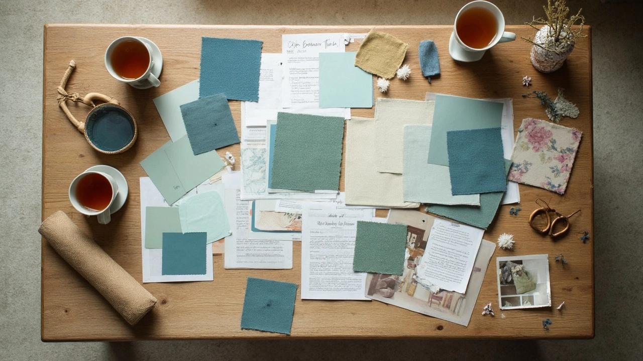
When in doubt, sample swatch. Pin a fabric piece next to your wall and watch it change throughout the day; daylight, afternoon sun, even lamplight make a huge difference. Light temperature is so underrated! If you paint-swatched your walls but skipped your curtain fabric, you’re missing half the story.
Here’s a fun trick designers use: ‘echo’ the curtain color somewhere else. (Picture a navy throw pillow, or a print with your curtain color in it.) Suddenly your room looks pulled together, like you knew exactly what you were doing all along.
Popular Curtain Colors and What They Signal in 2025
Color trends aren’t just for runways—curtain color trends move right along with fashion and paint obsessions. Right now, 2025 is all about ‘restful sanctuary’—greens, dusky blues, soft ochre, earth-inspired neutrals, and slightly vintage hues are everywhere. Big names like Pantone and Dulux tipped ‘Fresh Green’ and ‘Blue Nova’ as top colors for this year, and home stores scrambled to restock those curtain shades.
What does this mean for your living room? Pale, misty greens or powder blues make things calm, almost spa-like. Ochre, which is a warming mustard-y gold, brings cozy cheer without going full ‘70s. If you love natural wood furniture or have a bunch of indoor plants, these tones help everything click.
Neutrals aren’t going anywhere—gray, beige, and taupe are still huge because they go with literally anything. But we’re seeing more textured fabrics, like linen or woven blends, to keep neutral curtains interesting. The era of flat polyester panels is dying fast!
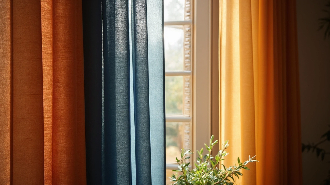
Unexpectedly, burgundy and burnt orange are back—but in muted, almost dusty versions. They’re for people who want to be bold, but not so much that neighbors gossip about their crazy curtains every time they peek through the window.
If choosing just one color sounds too final, try layering. Designers now combine sheer white panels under colored curtains, letting you switch it up depending on season or sunlight. This way, every day feels a little different—and you don’t have to commit so hard to one mood.
The Science Behind Color and Light: Room Direction, Size, and Curtain Fabric
You might think curtain color is just about looks, but there’s actual science at play—especially with sunlight. If your living room faces north, the light is cool and can make blues and greens look icy. South-facing rooms get warm sun all day, so pale curtains keep things breezy. East-facing windows catch cool morning light, best for soft neutrals, while west-facing rooms can feel golden and intense by afternoon, perfect for muted blues and greens that calm down the glow.
This isn’t just a theory; tons of interior designers use a trick called “color zoning,” matching curtain colors to the room’s light for better balance. Brown University’s School of Design shared in 2025 that rooms with curtain colors complementing their daylight type seemed up to 20% brighter on light-meter tests than those where color fought with the sunlight.
Room size makes a difference too. Small living rooms go from cozy to cramped with dark, heavy curtains. Light, flowy fabrics—think linen, voile—can make a tight space breathe. Huge living rooms handle darker curtains better, but even then, sheer layers lend an airy vibe so it never feels oppressive.
Now, fabric’s a game-changer. Heavy velvet blocks light and drafts, awesome for theater vibes or old-school drama, but hopeless for a sunny, plant-filled nook. Cotton, linen, or blended synthetic panels offer the perfect mix—enough privacy, but sunlight still pours through. These fabrics let you try trending colors without sacrificing brightness.
Insider tip: line your curtains if you want color on both sides. Many colored panels without proper lining bleach out fast, especially reds and blues. Basic polyester lining can double the color’s lifespan, which shows up in plenty of rental apartments that still have faded magenta panels from five tenants ago.
Tips for Picking the Best Curtain Color for Your Living Room
Okay, bringing it all together—what’s the winning formula? Start by thinking about the vibe you want. More energy? Go for warm, saturated tones like ochre, blush, or terracotta. Craving calm? Soft greens, blues, or creamy whites all the way. For flexibility, nothing beats neutral grays or beiges—they’ll play nice with every pillow and rug, even if you swap things seasonally.
Want it to look designer-level? Use this three-step checklist:
- Test large fabric swatches in natural and artificial light for at least a few days.
- Pair curtain color with at least one other décor piece—like a cushion, an art print, or a rug—so the look feels intentional.
- Consider layering: get sheer panels for daytime softness, then heavier side curtains for privacy or drama at night.
Don’t skip maintenance—deep-colored curtains need occasional sun protection, and lighter ones benefit from stain-guarding (especially in homes with pets or snack-loving teenagers). Most big home improvement stores now offer free fabric swatches online—get four or five, hold them against your wall, and live with them before ordering full panels. There’s nothing worse than loving a color in the store and hating it at home!
Last tip: trends are fun, but your living room should feel like you. The best curtain color is the one that, every time you walk in, makes you smile. If that’s neon yellow or classic taupe, nobody but you needs to get the appeal. After all, in home design, the only real rule is this: you’re the one living there.