Living Room Luxury Audit
Answer these questions honestly to see how close you are to an expensive-looking space without spending a fortune.
Your Luxury Score
Top Recommendations:
You walk into a friend’s house, and something feels... different. The air is crisp, the light is soft, and everything just fits. You think, "This must have cost a fortune." Then you find out they bought the sofa from a clearance sale and painted the walls themselves. What’s their secret? It isn’t money. It’s intention.
Most people assume that an expensive-looking living room requires designer furniture and custom millwork. That’s a myth. High-end interiors rely on specific visual cues: proportion, lighting quality, texture layering, and restraint. You can replicate these cues with smart choices and minor tweaks. Whether you’re in Auckland or anywhere else, the principles of luxury are universal. Let’s break down exactly how to elevate your space without draining your bank account.
Lighting Is the First Lie You Tell Yourself
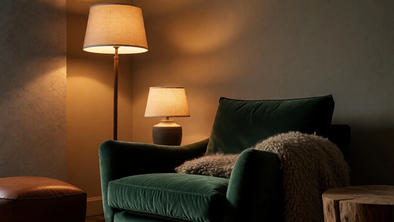
If you only have one overhead light, your room will never look expensive. Flat, harsh lighting exposes flaws and flattens depth. Luxury spaces use layered lighting. Think of it like cooking: you need heat, flavor, and aroma working together.
Start by ditching the single ceiling fixture. Replace it with three sources: ambient (general), task (reading/coffee), and accent (art/architecture). Use warm bulbs-2700K to 3000K color temperature. Cool white (4000K+) looks like a hospital waiting room. Install dimmers on every switch if possible. Dimming lights instantly adds drama and intimacy.
Consider floor lamps with fabric shades rather than bare bulbs. Fabric diffuses light, creating a softer glow. Table lamps should be placed at eye level when seated, not too high. If you rent, plug-in sconces are a game-changer. They add vertical interest and mimic built-in fixtures for under $100 each.
The Rule of Three Textures
Flat rooms feel cheap. Rich rooms feel tactile. To achieve this, layer at least three different textures in any given view. For example, pair a smooth leather sofa with a chunky wool throw and a velvet cushion. Add a jute rug underneath for contrast against hard floors.
Here’s a simple formula for texture stacking:
- Hard: Wood, metal, stone, glass.
- Soft: Linen, cotton, velvet, silk.
- Fuzzy/Natural: Wool, sheepskin, rattan, sisal.
Don’t match everything perfectly. A polished marble coffee table next to a rough-hewn wooden side table creates tension, which reads as curated. Avoid synthetic fabrics that shine under direct light; they scream "budget." Stick to natural fibers where visible. If you must use polyester blends, choose matte finishes over glossy ones.
Curtains Should Touch the Floor (and the Ceiling)
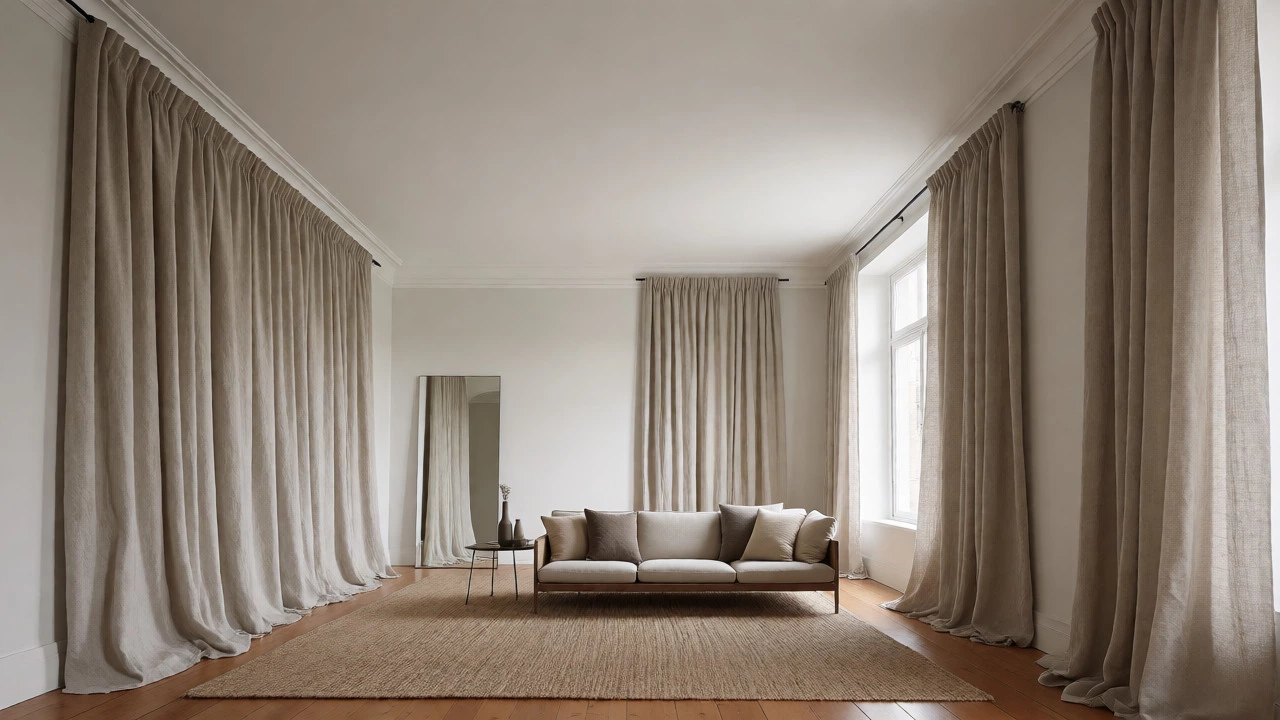
This is the number one mistake I see. Curtains hung right above the window frame make ceilings look low and windows look small. Luxury interiors hang curtains as high as possible-just below the ceiling molding-and let them pool slightly on the floor.
Why does this work? It draws the eye upward, making the room feel taller and more grandiose. Even if you have standard 8-foot ceilings, this trick visually stretches the space. Buy extra length. If you buy ready-made panels, hem them yourself or pay a tailor. It’s a $20 fix that changes the entire vibe.
Choose heavy fabrics. Light, sheer materials flutter and look flimsy. Opt for linen blends, velvet, or thick cotton. Iron them before hanging. Wrinkled curtains ruin the effect faster than anything else. If you hate ironing, steam them while they’re still on the rod.
Declutter Like a Minimalist, Style Like a Collector
Clutter kills luxury. An expensive-looking room breathes. Remove anything that doesn’t serve a purpose or bring joy. Then, group remaining items in odd numbers. Three vases look better than two or four. This isn’t superstition; it’s visual balance. Odd numbers create asymmetry, which feels more dynamic and less staged.
Use negative space intentionally. Don’t fill every wall. Leave breathing room around artwork. When you display objects, curate them. One beautiful ceramic bowl beats five random knick-knacks. Rotate displays seasonally to keep things fresh without buying new stuff.
| Element | Budget Choice | Expensive-Looking Swap |
|---|---|---|
| Art | Prints in plastic frames | Framed posters with matting & wood frames |
| Rugs | Synthetic shaggy rugs | Flat-weave wool or vintage-style prints |
| Cushions | All matching sets | Mixed sizes, shapes, and textures |
| Hardware | Plastic knobs/pulls | Brushed brass or matte black metal |
Paint and Hardware Are Your Secret Weapons
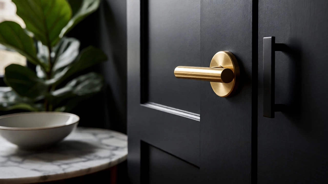
You don’t need new cabinets or doors. Just change the hardware. Swap out builder-grade door handles, cabinet pulls, and light switches for updated finishes. Brushed nickel, matte black, or unlacquered brass instantly modernize a space. These items cost $5-$15 each but transform the perception of quality.
Paint is another powerhouse. White walls aren’t always best. Deep, moody colors like charcoal, navy, or forest green add depth and sophistication. Paint your trim the same color as the walls for a seamless, monochromatic look. This hides imperfections and makes corners disappear, expanding the perceived space.
If you’re renting, paint the inside of bookshelves or the back of open cabinets. It’s unexpected and adds character. Test samples on large boards before committing. Colors shift dramatically based on lighting direction. North-facing rooms get cooler light; south-facing get warmer. Adjust your choice accordingly.
Scale and Proportion Matter More Than Brand Names
A tiny sofa in a huge room looks sad. A massive sectional in a cozy nook feels cramped. Measure your space before buying anything. Furniture should leave enough walking room-at least 18 inches between pieces. In smaller rooms, choose leggy furniture. Seeing the floor beneath sofas and chairs makes the area feel larger and airier.
Mirrors are essential for amplifying light and space. Place a large mirror opposite a window to bounce daylight deeper into the room. Frameless mirrors look sleeker; ornate frames add vintage charm. Ensure the mirror reflects something beautiful-a plant, a lamp-not clutter.
Add life with plants. Real ones, not plastic. Large floor plants like Fiddle Leaf Figs or Monstera add organic curves that soften rigid architecture. Group pots in threes for impact. Use simple ceramic or terracotta pots; avoid loud patterns unless they’re part of a deliberate theme.
The Final Polish: Details You Can’t Ignore
Luxury lives in the details. Check your baseboards. Are they clean? Dust them weekly. Clean your windows monthly. Dirty glass dulls light. Hide cords. Visible wires make even the most expensive setup look messy. Use cable management sleeves or route cords behind furniture.
Smell matters. A neutral scent like linen or sandalwood signals cleanliness. Avoid overpowering air fresheners. Use beeswax candles or subtle reed diffusers. Soundscapes help too. Soft background music or a quiet fan hum masks street noise, adding comfort.
Finally, edit ruthlessly. If something bothers you, remove it. Maybe it’s a chipped mug, a crooked picture, or a pile of mail. Fix it or hide it. An expensive-looking room feels effortless because there’s nothing distracting you from its beauty.
Does painting my living room dark make it look smaller?
Not necessarily. Dark colors recede, which can make walls feel further away. If you have good lighting and high ceilings, dark paint adds depth and coziness. It works especially well in rooms with lots of natural light. Pair dark walls with lighter furniture to maintain contrast.
What is the cheapest way to upgrade my living room?
Changing lighting fixtures and swapping out hardware (door handles, cabinet pulls) offers the highest return on investment. Both are inexpensive, easy to install, and drastically change the perceived quality of the space. Painting is also highly effective if done correctly.
How many cushions should be on a sofa?
There’s no strict rule, but aim for an odd number per side (e.g., three total). Mix sizes and textures. Two large square cushions plus one smaller lumbar pillow usually works well. Too many cushions look cluttered; too few look sparse.
Do I need real art to make a room look expensive?
No. Framed high-quality prints look just as good if presented properly. Use wide mats and solid wood frames. Avoid generic mass-produced prints with bright primary colors. Choose abstract or monochrome pieces that complement your palette.
Is velvet too trendy for a long-term look?
Velvet has been popular for centuries. While certain cuts might date, the material itself signals luxury due to its weight and sheen. Stick to classic colors like emerald, sapphire, or deep burgundy. Avoid neon hues. Velvet ages well if maintained properly.