Big truth: your walls are the largest design surface in your home. Get them right and the room suddenly feels expensive-even if the sofa isn’t. You don’t need marble or a stylist on call. You need a plan: the right paint sheen, layered lighting, a bit of architectural detail, and smart texture. Done well, your space reads as calm, tailored, and intentional.
I’m Jasper in Auckland, and I’ve learned this the hard way-through rentals, renos, salty coastal air, and too many paint samples. Here’s how to get luxury walls at any budget and avoid the stuff that cheapens a room.
TL;DR + The Luxury Wall Playbook (Step-by-Step)
TL;DR
- Fix the surface first: smooth walls, crisp trim, gap-free caulk. Prep is 70% of the look.
- Choose low-chroma colors, a refined sheen (eggshell/low sheen), glossy trim, and a deeper tone on doors.
- Add one depth move: wainscoting, fluted panels, grasscloth, limewash, or Venetian plaster.
- Layer lighting: wall washers, picture lights, or sconces at 2700K with dimmers; CRI 90+.
- Scale up art or mirrors and upgrade switch plates and door hardware.
What you want to get done after clicking this:
- Pick a color and sheen that instantly feels more high-end.
- Decide on one architectural detail (panels, plaster, or wallpaper) that suits your room and budget.
- Plan wall lighting that flatters people and texture.
- Style walls with correctly sized art and better hardware.
- Avoid common mistakes that make walls look cheap.
Step-by-step
- Assess your walls under night lighting. Harsh daylight hides less than warm lamps. Mark dents, seams, and nail pops with painter’s tape. Luxury reads as smooth and intentional.
- Prep like a pro. Fill imperfections twice, sand between coats (180-240 grit), vacuum dust, and tack cloth. Prime repaired areas. In older NZ villas, test for lead paint if pre-1980-work safely.
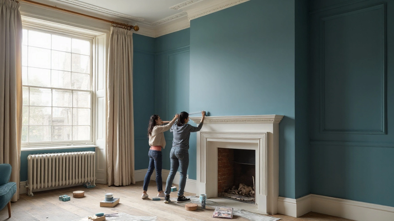
- Pick a palette that whispers, not shouts. Luxury walls rarely use loud saturation. Aim for muted, earthy, or smoky tones. In 2025, Dulux ANZ forecasts warm taupes, soft browns, and deep olive; Resene’s trends echo complex neutrals and inky blues. A rich envelope color on walls, ceiling, and trim looks tailored in small rooms and media spaces.
- Use the sheen ladder:
- Ceiling: flat/matt (hides flaws).
- Walls: low sheen/eggshell (around 7-10% gloss) for a soft, expensive glow.
- Trim and skirting: semi-gloss (20-40%) for contrast and cleanability.
- Doors: full gloss or high-gloss enamel for a subtle jewel effect.
Rule of thumb: the glossier the surface, the more prep you need. If your walls are imperfect, don’t go above eggshell.
- Choose a depth move (pick one):
- Wainscoting (board-and-batten or shaker): adds structure fast. Paint in same color as walls for a quiet, expensive look.
- Fluted MDF panels: vertical rhythm that screams custom joinery without the cost.
- Limewash or Venetian plaster: soft, tonal movement; looks bespoke in bedrooms and entryways.
- Grasscloth wallpaper: adds texture and depth; excellent behind a bed or in a dining room. Avoid splash zones.
- Microcement or stone tile: for bathrooms and fireplaces; use sparingly.
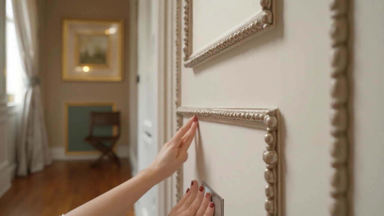
- Upgrade trim, skirting, and cornices. Taller skirting (120-180 mm) and simple square-edge profiles read modern and premium. Caulk every gap. Paint trim in a slightly different sheen or a half-strength of your wall color for depth.
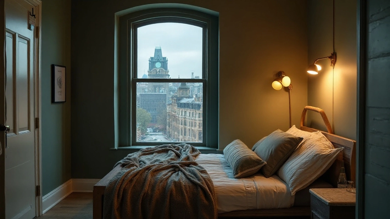
- Layer wall lighting. Add a pair of sconces or a picture light; place lighting to graze texture and highlight art. Use 2700K lamps (warm) with CRI 90+ so colors feel rich. Dim everything. The Illuminating Engineering Society guidance points to warm, layered light for homes-and it shows.
- Scale art up. One large piece beats a dozen tiny frames. The rule: art should be about 60-75% of the furniture width behind it. Hang center at 145-150 cm from the floor or relate to the furniture height if lower.
- Upgrade small details. Swap plastic switch plates for metal or matte black, use solid brass door hardware, and run cables inside cord covers. Even these tiny moves read “custom.”
- Style and edit. Keep wall decor intentional: a large piece, a textured backdrop, and one focal light. Negative space is a luxury signal.
Color cheat codes that rarely miss:
- Warm grey-beige (greige) walls + off-white trim + glossy black doors.
- Muted olive walls + linen curtains + antique brass picture lights.
- Charcoal envelope (walls/ceiling) + low sheen + walnut wood + wool rug.
- Soft taupe walls + tone-on-tone wainscoting + stone or ceramic table lamp.
Examples, Materials, and Price Tiers That Actually Look Expensive
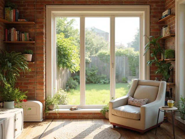
Example 1: Small city living room (renter-friendly)
- Paint: choose a warm grey with an LRV around 45 (not too bright). Low sheen for walls; keep ceiling flat.
- Texture: peel-and-stick linen-look wallpaper on one wall behind the sofa.
- Lighting: plug-in picture light above a large framed print. Use a warm 2700K bulb.
- Hardware: stick-on metal switch plate covers, removable. Black or brushed brass.
- Result: the room feels layered and grown-up without permanent work.
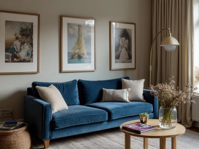
Example 2: Primary bedroom (owner)
- Paint: cocoon with one color across walls, skirting, and wardrobe doors; ceiling in a lighter tint.
- Depth: half-height shaker wainscoting behind the bed. Paint it the same color, but in semi-gloss for contrast.
- Lighting: two hardwired sconces at 150-165 cm to center, dimmable. Add a small dim plug-in picture light over a dresser art piece.
- Textiles: wool throw and heavy curtains-luxury walls look better when the room is quiet and tactile.
Example 3: Hallway (the secret flex)
- Paint: rich mid-tone (deep taupe or moody blue) in low sheen for walls. Gloss trim. Doors one step darker.
- Lighting: wall washers or low-profile sconces to graze texture or art. Even a tight corridor looks expensive when lit well.
- Detail: uniform black frames in a tidy line-same sizes, consistent spacing.
Materials: what reads expensive (with NZ-friendly notes)
- Paint
- Brands: Resene and Dulux dominate in NZ; both offer excellent low-odour, wash-resistant ranges. Look for scrubbable, stain-resistant lines.
- Finish rule: low sheen for walls; semi-gloss for trims; high-gloss for doors if surfaces are near-perfect.
- Sampling: always do 3 swatches (lightest, target, darkest) on two walls; check at night under warm light.
- Wainscoting (board-and-batten, shaker)
- Pros: architectural structure, hides lower-wall scuffs, classic in villas and modern homes.
- Cons: needs accurate spacing; caulk and sand every joint.
- Tip: height at 1/3 to 2/5 of wall height looks balanced; top it with a simple ledge.
- Fluted/Slat panels (MDF or real timber)
- Pros: instant bespoke feel; vertical lines make ceilings look higher.
- Cons: dusting; corners need clean termination.
- Placement: use on one wall or as half-height detail to avoid overkill.
- Limewash and Venetian plaster
- Limewash: soft, cloudy depth; breathable-good for older homes with mild moisture issues.
- Venetian plaster (Marmorino): polished, stone-like sheen; looks special in entries and powder rooms.
- Note: avoid heavy trowel texture in rentals; patching is pain.
- Wallpaper
- Grasscloth: natural, elegant; seams show (that’s okay). Keep away from splashes.
- Textile-look vinyl: great for bathrooms and rentals; washable and more forgiving.
- Silk looks: gorgeous but fragile; consider dining rooms or bedrooms.
- Stone, tile, microcement
- Use: fireplace surrounds, feature walls in baths; balance with soft paint elsewhere.
- Note: check substrate and waterproofing; heavy finishes need proper fixings.
- Lighting
- Sconces: place at 150-165 cm to the center; 1.5-1.8 m apart in halls.
- Picture lights: width close to art width; aim for 2700K, high CRI, dimmable.
- Wall washers/grazers: mount to skim textured walls and make them glow.
What makes walls look cheap (avoid these):
- Unprepped seams, orange-peel texture, and brush drags made obvious by too-glossy paint.
- Tiny, scattered frames at random heights; mismatched hardware finishes across one wall.
- Harsh 4000K+ lighting that turns everything blue and flat.
- Over-saturated accent walls with no connection to furnishings.
- Dirty or yellowed old switch plates next to crisp new paint.
Price sense (NZD ballparks to plan with)
- Paint: Premium interior paint $90-$160 per 4L; a typical room needs ~6-8L for two coats on walls (depends on coverage).
- Simple wainscoting: DIY materials $200-$600 for a standard wall; labour pushes it to $700-$1,500+.
- Fluted MDF: $60-$130 per m² for materials; installed $180-$350 per m².
- Limewash: similar to paint if DIY; pro finish $35-$60 per m² depending on coats.
- Venetian plaster: pro-applied $120-$300 per m²; small feature walls keep costs sane.
- Grasscloth: $100-$300 per roll; pro hanging adds similar again.
- Sconces/picture lights: quality fixtures $150-$600 each; add electrician time if hardwiring.
Fast pairing guide
- Modern minimal: low-sheen greige walls + squared skirting + fluted half-wall + black metal picture lights.
- Classic villa: creamy walls + tall skirting + shaker wainscoting + antique brass sconces.
- Japandi calm: warm putty walls + limewash texture + oak slat detail + linen curtains.
- Moody den: charcoal envelope + high-gloss black doors + walnut frames + dim wall washers.
Heuristics that save time
- Choose a wall color with LRV between 20-45 for cozy, luxe feel; go lighter in small, low-light rooms.
- One depth move per room: panel OR plaster OR wallpaper. Layering too many looks busy, not luxe.
- Limit finishes: 2 metals max (e.g., brass + black). Keep consistency across the wall.
- Doors one shade darker than walls read intentional without screaming for attention.
Checklist, FAQ, and Next Steps for Different Homes
Luxury wall checklist
- Prep: fill, sand, prime; caulk gaps; dust-free before painting.
- Color: low-chroma, tested at night; ceiling flat, walls eggshell, trim semi-gloss.
- Depth: pick one-wainscoting, fluted panel, limewash, Venetian plaster, or refined wallpaper.
- Lighting: add sconces or picture lights; 2700K, CRI 90+, dimmable.
- Hardware: upgrade switch plates and door handles; match finishes.
- Art: one large piece or a tight gallery; correct height and spacing.
- Edit: leave blank space; avoid visual clutter.
Mini-FAQ
- What’s the fastest, cheapest luxury upgrade? Change sheen and trim. Low-sheen walls with semi-gloss trim and a deeper, glossier door look custom within a weekend.
- Small room-dark or light? Both can work. Dark envelopes feel cocooned and luxe; go lighter if the room has no natural light and low ceilings. Keep contrast low either way.
- Rental-safe options? Peel-and-stick textured wallpaper, plug-in sconces/picture lights, removable switch plate covers, large art, and linen curtains. Keep the toolkit minimal and reversible.
- Bathroom walls that feel expensive? Tadelakt or microcement by a pro; otherwise, high-quality washable paint in a warm neutral plus a tiled feature niche. Use extraction-NZ humidity will test everything.
- How many accent walls? Usually one. If you do an envelope (all walls + ceiling), that’s the move-not multiple random accents.
- Match trim to walls? Yes, and it’s chic. Use the same color with a different sheen or go half-strength lighter for subtle contrast.
- Do I need an undercoat? If changing from dark to light, going to a different base (e.g., cool to warm), or painting fresh plasterboard-yes. It makes the finish look even and expensive.
- What about acoustics? Textured finishes like limewash and grasscloth help. Add curtains and rugs to reduce echo; your walls will look and sound richer.
- Old villa with questionable paint? If it’s pre-1980, assume possible lead layers. Use safe methods or call in a pro-no dry sanding without proper controls.
- How to hang art in quake-prone NZ? Use earthquake putty on frame corners and secure hooks rated for the weight. Keep heavy pieces away from beds.
Troubleshooting
- Wall looks patchy after two coats: you’re seeing flashing. Apply a high-quality primer, then repaint with longer wet edges. Use a better roller (10-12 mm nap) and maintain consistent pressure.
- Gloss shows every flaw: step down sheen or polish the surface more. Add a skim coat to bad areas; prime and try again.
- Color reads green/yellow at night: your bulbs are too cool or low CRI. Switch to 2700K, CRI 90+ LEDs and re-evaluate before repainting.
- Grasscloth seams stand out: that’s normal. Keep patterns simple and lighting soft. If it bothers you, choose textile-look vinyl with subtle seams.
- Panels feel busy: increase spacing, reduce height, or paint panel and wall the same color to quiet the look.
Next steps by scenario
- Weekend facelift (under $300):
- Fix dents, sand, and repaint walls in low sheen.
- Gloss the doors a shade darker.
- Swap switch plates; hang one oversized art piece you love.
- Renter playbook:
- Peel-and-stick textured wallpaper behind the bed or sofa.
- Plug-in picture light and cord covers; upgrade bulbs to 2700K, CRI 90+.
- Lean a large mirror to bounce light; use earthquake putty for safety.
- Owner, modest budget:
- Add shaker wainscoting to the entry and hallway.
- Unify colors: walls + trim same hue, different sheens.
- Install two sconces to create pools of light and depth.
- Statement project:
- Venetian plaster feature wall in an entry or dining room.
- Fluted panels as a half-wall in the living room.
- Coordinated metal finishes (brass + black), dimmers everywhere.
- Family with kids:
- Washable low-sheen paint; semi-gloss trim for wipe-down.
- Wainscoting in the hallway to protect lower walls.
- Art ledges instead of a chaotic gallery wall.
- High humidity (Auckland bathrooms):
- Use paint rated for wet areas; ventilate well.
- Textile-look vinyl wallpaper or microcement in splash zones.
- Warm LED lighting to keep colors rich even on grey days.
Quick decision tree
- Walls look flat? Add panel OR texture OR lighting-pick one.
- Color feels cheap? Drop saturation, shift warmer, or reduce contrast between walls and trim.
- Room still busy? Remove small art; bring in one large piece and simplify finishes.
If you try only one idea this month, do the sheen upgrade and add a picture light. Every time I’ve done that-rental or reno-the room jumped a tax bracket. Then, when you’re ready, add a single depth feature. Keep it restrained, keep it warm, and let light do the heavy lifting.
Sources I trust for color and material calls in 2025: Dulux Colour Forecast (ANZ), Resene’s colour trends, and the Illuminating Engineering Society’s residential lighting guidance. They align on the same message: warmer, layered, low-glare environments feel richer and more human. Your walls can do most of that work.