Cozy Color Simulator
Select your wall color, lighting type, and room orientation to see how they interact to create warmth and comfort.
Analysis Result
Click "Analyze Coziness" to see how your choices impact the room's atmosphere.
You walk into a room. Maybe it’s your childhood bedroom or that one café corner you always claim on rainy days. What hits you first isn’t the furniture layout or the lighting fixtures. It’s the feeling of being wrapped in a blanket. That visceral sense of warmth, safety, and ease? That’s what we call coziness. And while texture plays a huge role, color is the silent architect of that mood.
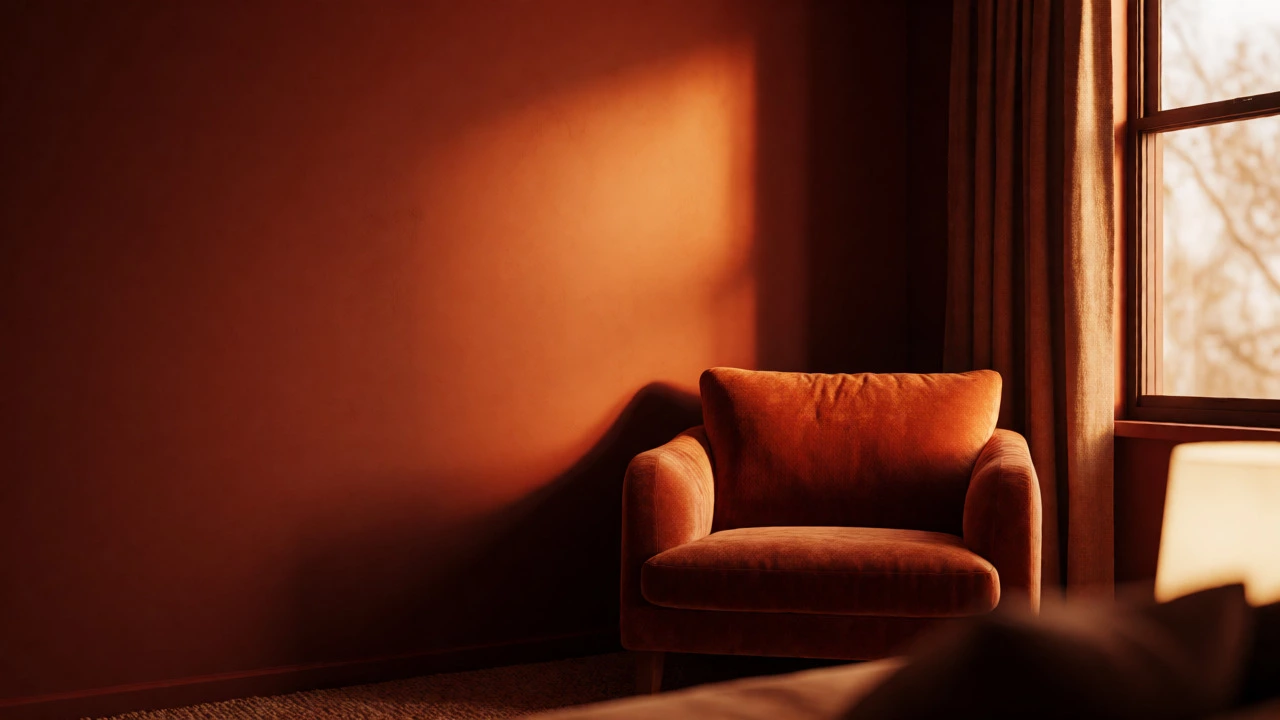
So, what is the most cozy color? If you ask ten designers, you’ll get ten different answers. But if you look at data from Color Psychology and real-world application in residential interiors, a clear winner emerges: deep, saturated earth tones, specifically terracotta, burnt orange, and rich chocolate brown. These aren't just "warm" colors; they are visually heavy in a way that lowers blood pressure and invites lingering.
The Science Behind Visual Warmth
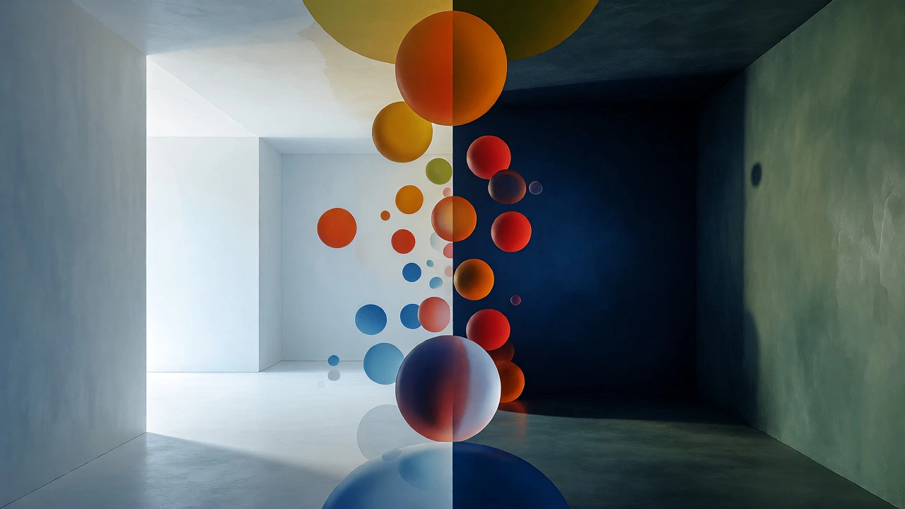
Why do some colors make us feel cold and others make us want to curl up with a book? It comes down to how our brains process light wavelengths. Long-wavelength colors-reds, oranges, yellows-are perceived as advancing toward the eye. They physically make large rooms feel smaller and more intimate. Short-wavelength colors like blues and greens recede, making spaces feel airy but often sterile.
However, brightness matters just as much as hue. A bright lemon yellow is energetic, not cozy. It demands attention. A muted mustard or ochre, however, absorbs light rather than reflecting it aggressively. This absorption creates a visual "weight." When a wall has visual weight, the space feels grounded. You stop looking around for exits and start looking inward.
| Attribute | Cozy Palette (e.g., Terracotta) | Sterile Palette (e.g., Cool White) |
|---|---|---|
| Light Reflection | Absorbs light, reduces glare | Reflects light, increases brightness |
| Perceived Temperature | Feels 3-5 degrees warmer | Feels neutral or cooler |
| Psychological Effect | Invites relaxation and conversation | Promotes alertness and cleanliness |
| Space Perception | Makes rooms feel smaller/intimate | Makes rooms feel larger/open |
Beyond Red: The Nuance of Earth Tones
People often mistake "cozy" for "red." While red is passionate, it can also be aggressive. Too much red raises your heart rate. You don’t want a racing pulse when you’re trying to decompress after work. The sweet spot lies in the transition between red and brown. Think Terracotta, which is essentially clay baked by the sun. It connects us to natural materials without the intensity of pure pigment.
Then there’s Sage Green. Yes, green is cool-toned, but sage is desaturated and grayed out. It mimics the forest floor. Studies in environmental psychology suggest that exposure to natural greens lowers cortisol levels. If you hate orange, sage is your best bet for a calm, organic coziness. It pairs beautifully with wood grains, enhancing the tactile experience of the room.
Don’t sleep on Navy Blue either. Specifically, midnight navy. Unlike sky blue, which feels open and breezy, navy feels like a night sky. It wraps around you. In small bedrooms or media rooms, navy walls disappear into shadow, creating a cocoon effect. It’s less about heat and more about enclosure.
Texture Multiplies Color Impact
You can paint a wall beige, and it will look flat. Paint it beige and add velvet drapes, wool rugs, and leather chairs, and suddenly it’s luxurious. Color provides the mood, but texture provides the comfort. The most cozy colors look their best when paired with matte finishes. Glossy paints reflect light and create highlights that break the illusion of softness. Matte or eggshell finishes diffuse light, making the color appear softer and more enveloping.
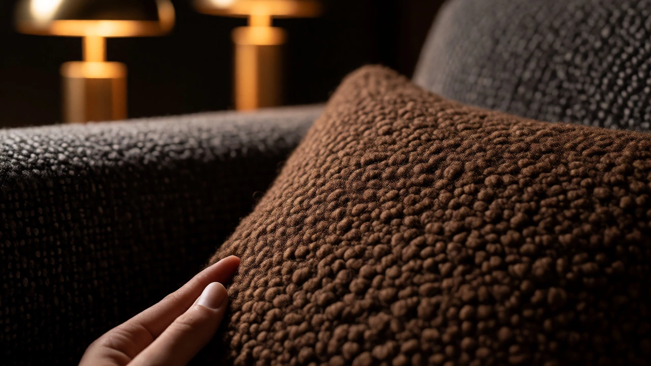
Consider the interplay between color and material. A charcoal gray sofa feels cold if it’s made of slick polyester. Make that same charcoal out of bouclé wool or nubby linen, and it becomes inviting. The irregularity of the fabric catches shadows, adding depth to the color. This is why dark colors often require more texture than light ones. Without texture, dark walls can feel oppressive. With texture, they feel rich.
Lighting Changes Everything
Here is the trap many homeowners fall into: choosing a paint color under fluorescent store lighting. Those lights have a high color rendering index but a cool temperature (around 4000K). They wash out warm tones. When you bring that "perfect" peach home and put it under 2700K incandescent bulbs, it might turn muddy or overly yellow.
To maintain coziness, stick to warm white bulbs (2700K-3000K) throughout your living space. Darker cozy colors absorb these warm lights, creating a glow rather than a glare. If you use LED smart bulbs, set them to a lower Kelvin rating in the evening. You want the light to mimic sunset, not noon. Sunset light enhances reds and oranges, amplifying the cozy factor of your chosen palette.
Practical Application: How to Choose Your Shade
Ready to pick a color? Don’t just buy a gallon. Follow this checklist:
- Test Large Swatches: Paint a 2x2 foot area on two different walls. One facing north, one facing south. North-facing rooms get cool, blue light, so they need warmer, deeper colors to balance. South-facing rooms get intense sunlight, so you can go slightly lighter or cooler without losing coziness.
- Check Undertones: Every color has an undertone. A "gray" might have a purple or green undertone. For maximum coziness, choose grays with brown or taupe undertones. Avoid grays with blue undertones unless you are going for a moody, nocturnal vibe.
- Consider Room Function: Is this a place for active conversation or quiet reading? High-energy rooms benefit from muted oranges or rusts. Quiet zones benefit from deep browns, olives, or navies.
- Balance with Neutrals: Even if you love a bold terracotta, don’t paint every surface. Use a creamy off-white for trim and ceilings. Pure stark white can clash with warm earth tones, making the room feel disjointed. Cream contains yellow pigments that harmonize with warm walls.
Common Pitfalls to Avoid
The biggest mistake is equating "dark" with "cozy." A black room can feel like a cave, not a hug. Coziness requires warmth. Black is neutral and can feel severe if not warmed up with brass accents, wood floors, or warm textiles. If you go dark, ensure the darkness has a hue-brown, blue, or green-not just value.
Another error is ignoring the ceiling. Painting walls a cozy deep red but leaving the ceiling stark white draws the eye upward, breaking the immersion. Consider painting the ceiling a shade lighter than the walls or using a warm cream. This keeps the visual envelope intact.
Finally, don’t forget about artificial coziness. If you rent and can’t paint, use textiles. A large, deep-colored rug anchors the room. Heavy curtains in a warm tone frame the windows. Throw pillows in velvet or faux fur add tactile warmth. You can simulate the effect of a cozy wall color through layers of fabric.
Real-World Examples
Imagine a small apartment living room. Walls painted in Farrow & Ball’s "Setting Plaster" (a dusty pink) combined with walnut furniture and brass lamps. The pink reflects warm light, making the space feel sunny even on cloudy days. Now imagine a basement den. Walls in Benjamin Moore’s "Dark Oak" (a deep brown-green) with a leather sectional. The dark color hides shadows and makes the low ceiling feel intentional, not cramped.
Both scenarios prove that coziness isn’t about one specific hex code. It’s about saturation, temperature, and context. The most cozy color is the one that makes you forget the outside world exists.
Is gray a cozy color?
Gray can be cozy, but only if it has warm undertones like brown, taupe, or beige. Cool grays with blue or purple undertones tend to feel clinical or modern rather than cozy. To make gray cozy, pair it with warm textures like wool, wood, and brass, and use warm lighting.
Does red make a room feel smaller?
Yes, red and other warm, saturated colors advance toward the viewer, making walls appear closer. This is actually desirable for coziness because it creates a sense of intimacy and enclosure. However, very bright reds can feel stimulating rather than relaxing, so muted reds or burgundies are better for relaxation.
What is the best cozy color for a north-facing room?
North-facing rooms receive cool, indirect light, which can make whites look blue and grays look dull. To counteract this, choose warm earth tones like terracotta, ochre, or warm taupes. These colors absorb the cool light and emit a perceived warmth, balancing the room's natural temperature.
Can I use blue for a cozy room?
Yes, but choose deep, muted blues like navy, slate, or teal. Avoid bright sky blues, which feel airy and expansive. Deep blues create a sense of depth and calm, similar to a night sky. Pair them with warm metallics like gold or copper to prevent the space from feeling too cold.
How does lighting affect cozy colors?
Lighting dramatically changes how color is perceived. Warm white bulbs (2700K-3000K) enhance warm colors like reds, oranges, and browns, making them richer and more inviting. Cool white bulbs (4000K+) can wash out warm tones and make them look flat or muddy. Always test your color choices under the actual lighting conditions of the room.