Wall Art Size Calculator
Calculate Your Ideal Wall Art Size
Based on professional interior design guidelines: Art should fill at least 2/3 of your wall's width for optimal visual impact.
Your Ideal Art Size
Pro Tip
For best results:
• Use 60-75% of wall width
• Keep center of art at 57-60 inches from floor
• Avoid small prints on large walls
Flat, bare walls feel empty-not because they’re missing something, but because they’re missing wall art. It’s not about buying expensive pieces or hiring a designer. It’s about turning blank surfaces into something that feels like you. The right wall art doesn’t just decorate a room-it tells a story, sets a mood, and makes the space feel lived-in and intentional.
Start with What You Love
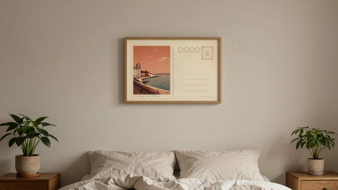
Too many people pick wall art because it matches the couch. That’s backwards. Your walls should reflect what moves you-not what’s trending on Pinterest. Think about the moments, colors, or objects that make you pause. A vintage postcard from a trip to Lisbon. A black-and-white photo of your grandparents. A print of your favorite book cover. These aren’t just decorations. They’re anchors.
One client, a nurse who worked 12-hour shifts, hung a single framed quote from a patient’s thank-you note on her bedroom wall. She said it was the first thing she saw every morning and the last thing she saw before sleep. It didn’t cost $100. It cost nothing. But it changed how she felt in that room.
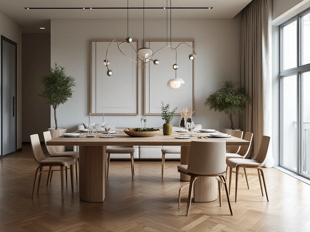
Size Matters More Than You Think
Small art on a big wall looks lost. A single 8x10 inch print in the center of a 12-foot wall? It’s like putting a postage stamp on a billboard. The fix? Go big-or go clustered.
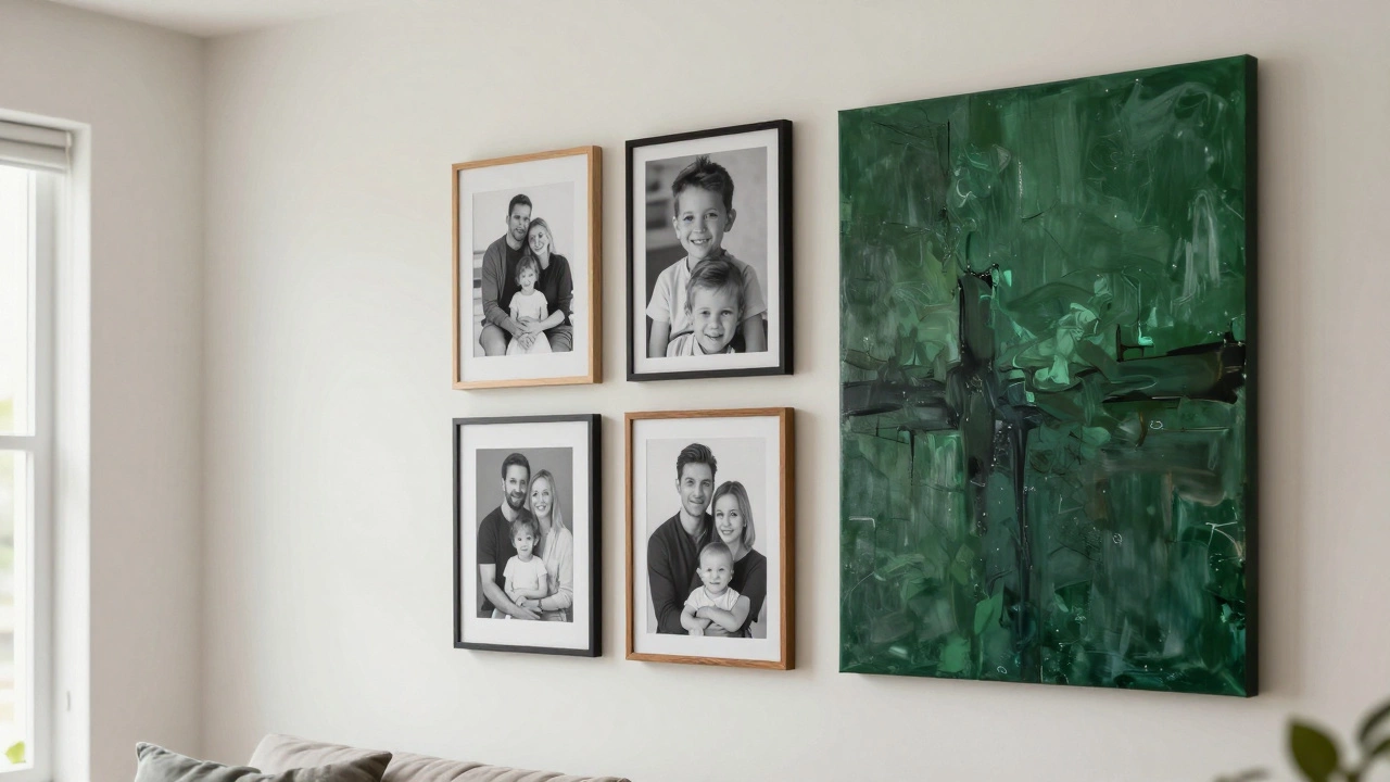
If you’re hanging one piece, aim for at least two-thirds the width of the wall space it’s on. For a 7-foot-wide wall, that means a piece around 5 feet wide. If you’re using multiple pieces, group them like a puzzle. Lay them out on the floor first. Don’t worry about symmetry. Uneven arrangements feel more alive. Try a 3x3 grid with one large center piece and smaller ones around it. Or hang three vertical prints in a row with 2 inches between them. The key? Keep spacing consistent. No random gaps.
Frame It Right
Frames aren’t just borders-they’re part of the art. A thick, dark wooden frame on a modern abstract print? That’s a clash. A thin, floating metal frame on a faded family photo? That’s magic.
For casual, lived-in spaces, skip glass. It reflects light and adds glare. Instead, use shadow boxes or deep-set frames that let the art breathe. If you’re hanging prints, consider matting. A white or cream mat gives breathing room and makes even cheap prints look like gallery pieces. You can buy pre-cut mats for $5 at craft stores. No need to spend hundreds.
Use Texture and Layering
Flat prints are fine. But texture? That’s where walls come alive. Try a woven tapestry. A ceramic wall plaque. A metal sculpture with depth. Even a collection of vintage mirrors adds dimension. One homeowner in Portland hung a series of old, slightly tarnished mirrors above her sofa. They didn’t reflect the room-they reflected light, and that made the space feel bigger, brighter, and more dynamic.
Layering also means mixing materials. A canvas next to a wooden sign next to a metal quote. Don’t match everything. Let contrast do the work. A rustic wooden frame beside a sleek black frame? That’s visual rhythm.
Don’t Forget the Power of Color
Color on your walls doesn’t have to come from paint. Your art can be the color source. If your room is mostly neutrals-grays, whites, beiges-then a single bold red, deep blue, or emerald green piece can become the focal point. One study from the University of Minnesota found that rooms with a single vibrant art piece were rated as 37% more inviting than those with all-neutral decor.
Try this: Look at your walls. What color is the wall behind your couch? Now find one piece of art that matches that color exactly. Hang it. Suddenly, the whole room feels more put together-even if nothing else changed.
Think Beyond the Living Room
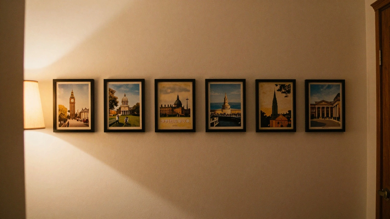
Most people focus on the living room. But the hallway, staircase, bathroom, or even the kitchen backsplash are blank canvases waiting to be activated. A narrow hallway? Hang a row of small, matching prints in a straight line. It makes the space feel longer. A bathroom with no windows? A framed botanical print with greens and blues can make it feel like a spa. Even a plain kitchen wall can get a lift with a single framed recipe card from your grandma.
It’s Not About Perfection
You don’t need to get it right the first time. Art evolves. What feels right today might feel stale in six months. That’s okay. Swap out a print. Move a mirror. Add a new piece. The goal isn’t to create a museum. It’s to create a space that changes with you.
One woman I know keeps a small shelf next to her entryway. Every time she travels, she brings back one small item-a postcard, a stone, a tiny sculpture-and adds it to a rotating wall display. She says it’s like having a piece of her journey on display. No one else notices. But she does. And that’s what matters.
What to Avoid
- Don’t hang art too high. The center of the piece should be at eye level-about 57 to 60 inches from the floor.
- Avoid overcrowding. More isn’t better. A wall with five pieces can feel cluttered. A wall with three thoughtful pieces can feel like a gallery.
- Don’t use cheap, flimsy frames. They warp over time and look cheap under light.
- Don’t ignore lighting. A small LED picture light can make art pop. Even a floor lamp angled just right adds drama.
Quick Starter Checklist
- Choose one wall that feels dead-maybe behind your bed, sofa, or desk.
- Find one item you love: a photo, a print, a mirror, a plate.
- Measure the wall space. Pick an art size that fills at least 60% of it.
- Use painter’s tape to mock up placement on the wall.
- Hang it. Step back. Live with it for a week.
- Then, add one more piece next month.
Wall art isn’t about filling space. It’s about making space feel like home. You don’t need to spend a lot. You just need to choose things that mean something.
What’s the cheapest way to make walls attractive?
Start with what you already own. Frame a favorite photo, a child’s drawing, or a vintage poster. Use thrifted frames for under $5. A simple black frame and matte can turn a $2 print into something that looks like it belongs in a gallery. You don’t need to buy new art-you need to reframe what you already love.
Can I use wallpaper instead of art?
Absolutely. Wallpaper isn’t just for feature walls anymore. Modern peel-and-stick options are easy to install, removable, and come in bold patterns or subtle textures. A single wall with a soft geometric print or a muted botanical design can be more impactful than ten small frames. Just pick one accent wall-it’s enough to transform the room.
How do I hang art without nails?
Use Command Strips or similar removable hooks for lightweight pieces under 10 pounds. For heavier frames, try adhesive wall anchors like Monkey Hooks or 3M Damage-Free Hooks. Always check the weight limit. If you’re unsure, go with a lighter frame or use a floating shelf to display art on top instead of hanging it.
Should all my wall art match?
No-and it shouldn’t. Matching art looks staged. Instead, look for cohesion through color, texture, or theme. Maybe all your pieces have blue tones. Or maybe they’re all black-and-white. Or maybe they’re all from places you’ve traveled. That’s cohesion without sameness. Let variety add life.
Where should I hang art in a small room?
In small rooms, hang art at eye level and avoid clutter. One large piece works better than several small ones-it creates a focal point without overwhelming the space. Try hanging above a console table, beside a window, or on the wall opposite the door. This draws the eye in and makes the room feel intentional, not cramped.