Kitchen Design Balance Calculator
Quick Balance Check
You’ve probably heard of the Pareto Principle-the idea that 80% of results come from 20% of efforts. But when designers talk about the 80/20 rule in the kitchen, they aren’t talking about productivity. They’re talking about visual balance.
In interior design, this rule is a golden standard for creating spaces that feel curated rather than chaotic. It suggests that your kitchen should be composed of 80% neutral or dominant elements and 20% accent or statement pieces. Get this ratio wrong, and your kitchen might feel either sterile and boring or overwhelming and messy. Get it right, and you have a space that feels intentional, stylish, and incredibly livable.
What exactly does the 80/20 rule mean in kitchen design?
It means 80% of the room’s visual weight should be neutral or foundational (like cabinets, walls, and floors), while 20% can be bold, colorful, or decorative (like backsplashes, hardware, or art).
Understanding Visual Weight and Balance
To apply this rule, you first need to understand "visual weight." Not all objects take up the same amount of mental space. A large, dark cabinet has more visual weight than a small, white appliance. A busy patterned tile has more weight than a plain painted wall.
Visual Weight is the perceived heaviness of an element in a design based on its color, size, texture, and complexity.If you fill 80% of your kitchen with high-contrast colors, complex textures, and loud patterns, your eyes have nowhere to rest. The result is visual fatigue. On the flip side, if 100% of your kitchen is beige and flat, it lacks character. The 80/20 rule creates a hierarchy. It tells your brain where to look and what to ignore.
Think of it like dressing for an event. You wear neutral pants and a shirt (the 80%) so that your statement jacket or accessories (the 20%) actually stand out. In a kitchen, the "pants" are your cabinetry, countertops, and flooring. The "accessories" are your faucet, light fixtures, backsplash, and decor.
The 80%: Building Your Neutral Foundation
The majority of your kitchen needs to be calm. This doesn’t mean boring-it means cohesive. These elements form the backdrop against which everything else shines. If you change these often, you’ll spend a fortune and still feel like something is off.
- Cabinetry: This is usually the largest surface area in the room. Choosing a solid color-white, navy, sage green, or wood tone-for 80% of the cabinets keeps things grounded.
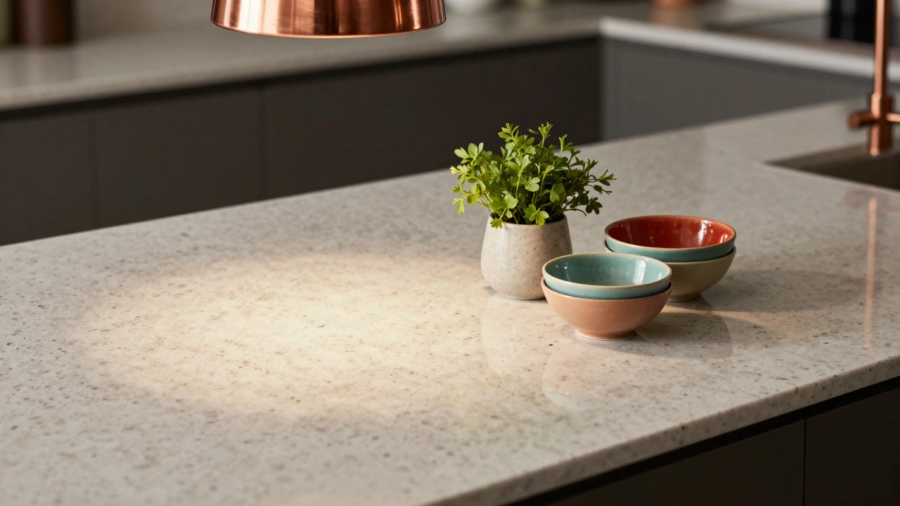
- Countertops: While marble is beautiful, a highly veined stone can add too much visual noise if used everywhere. Many designers opt for a simpler quartz or slab granite here to keep the base clean.
- Flooring: Floors anchor the room. A consistent material, like wide-plank oak or neutral ceramic tile, ensures the eye moves smoothly across the space without getting stuck on random patterns.
- Walls: Painted walls in a matte or eggshell finish provide a soft contrast to glossy cabinets. Stick to one main wall color to maintain unity.
When selecting these major components, prioritize durability and timelessness over trends. Since they make up the bulk of the room, you want them to age gracefully. A classic shaker-style cabinet in a muted gray will serve you better for decades than a trendy metallic finish.
The 20%: Adding Personality and Focus
This is where the fun begins. The 20% allows you to inject your personality into the space without risking chaos. These are the elements that draw the eye and create interest. Because they are limited in scope, they can be bolder, brighter, or more intricate.
Accent Elements are design features used sparingly to create focal points and add character, such as colorful backsplashes, unique lighting, or metallic hardware.Here’s how you can deploy your 20% effectively:
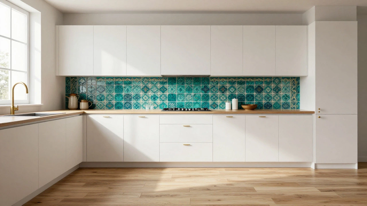
- The Backsplash: This is the most common place for the 20%. If your cabinets are white and your counters are gray, a hand-painted Moroccan tile or a bold blue subway tile becomes the star of the show.
- Hardware: Cabinet pulls and knobs are small but impactful. Swapping standard silver handles for black matte or brass ones instantly changes the vibe. Keep the style consistent throughout the 20% zone.
- Lighting: A dramatic pendant light over the island or under-cabinet LED strips can define the mood. Lighting is both functional and decorative, making it a perfect candidate for the accent category.
- Decor and Textiles: Open shelving displays, colorful dishware, a woven rug, or fresh herbs in pots. These are easy to swap out if your tastes change, keeping the risk low.
The key is restraint. If you love patterned tiles, don’t use them on the floor, the backsplash, and the island front. Pick one spot. Let that one spot shine. Everything else should step back.
Common Mistakes That Break the Rule
Even experienced homeowners mess this up. Usually, it happens because we fall in love with individual pieces without seeing the whole picture. Here are the most frequent pitfalls:
| Mistake | Why It Fails | The Fix |
|---|---|---|
| Too many patterns | Clashing visuals cause eye strain and make the room feel smaller. | Keep patterns to the 20% zone (e.g., just the backsplash). Keep the 80% solid. |
| Ignoring scale | A huge chandelier in a small kitchen overwhelms the space. | Ensure accent pieces fit the physical dimensions of the room. |
| Conflicting styles | Modern cabinets with rustic farmhouse accents create confusion. | Choose a primary style for the 80% and ensure the 20% complements it. |
| Over-accessorizing | Clutter on counters hides the beautiful foundation you built. | Clear 80% of counter space. Only display essential or stunning items. |
Another subtle error is ignoring color temperature. If your 80% is warm wood tones and your 20% is cool chrome steel, the clash can feel jarring. Ensure your accents harmonize with the base palette. Warm woods pair well with brass or copper; cool grays work best with nickel or glass.
Applying the Rule to Different Styles
The 80/20 rule isn’t just for minimalists. It works across various design aesthetics, provided you adjust what constitutes "neutral" and "accent."
For Modern Minimalism: The 80% is likely white, gray, or black with clean lines. The 20% might be a single pop of color-a red bar stool or a yellow pendant light. Texture plays a big role here; concrete vs. velvet.
For Farmhouse Chic: The 80% includes shiplap walls, white cabinets, and wood floors. The 20% could be vintage signage, mason jar lighting, or a colorful floral runner. The goal is cozy, not cluttered.
For Industrial Loft: The 80% features exposed brick, metal beams, and dark wood. The 20% might be neon art, leather seating, or bright orange appliances. The contrast between rough and refined is key.
No matter the style, the principle remains: establish a dominant theme and punctuate it with deliberate exceptions. This prevents the "catalogue showroom" look where every piece fights for attention.
Practical Tips for Renovation Projects
If you are planning a renovation, start with the 80%. Make your decisions on cabinets, flooring, and countertops first. Once those are locked in, look at the remaining 20% budget for accents. This approach saves money because you won’t overspend on flashy items that end up clashing with your base.
Also, consider lighting early. Poor lighting can ruin even the best 80/20 balance. Natural light highlights textures, while artificial light sets the mood. Ensure your accent pieces are illuminated properly. A beautiful backsplash looks dull in shadow; a striking island looks harsh under direct spotlighting. Layer your lighting to reveal the depth of your design choices.
Finally, live with it. After the renovation is done, observe how you use the space. Do you find yourself distracted by the decor? Does the room feel cramped? If so, you may have tipped the scale toward the 20%. Remove items until the space breathes again. Remember, less is often more when it comes to visual clarity.
Can I use the 80/20 rule for small kitchens?
Absolutely. In fact, it’s crucial for small spaces. A heavy 20% can overwhelm a tiny room, so keep accents simple and scaled down to maintain a sense of openness.
What if I love color everywhere?
You can still use the rule by defining your "neutral" as a bold color. For example, if you love blue, make your cabinets and walls different shades of blue (80%) and use gold or white for accents (20%). Monochromatic schemes count as neutrals within the rule.
Does the 80/20 rule apply to open-plan living areas?
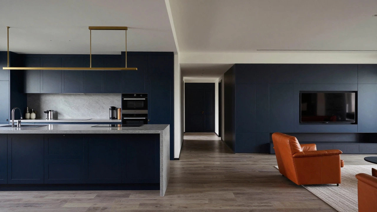
Yes. When the kitchen flows into the living room, the 80% should extend across both spaces to create continuity. Use the 20% to subtly distinguish the zones, perhaps with different lighting or rug textures.
How do I handle appliances in the 80/20 mix?
Large appliances like refrigerators and ovens usually fall into the 80% category due to their size. Choose finishes that blend with your cabinets. Smaller appliances like toasters or coffee makers can be part of the 20% if they are visually appealing.
Is the 80/20 rule strict or flexible?
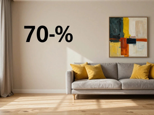
It’s a guideline, not a law. Some designers prefer a 70/30 split for more eclectic tastes. The goal is balance, not mathematical precision. Trust your eyes-if it feels balanced, it works.