Bedroom Calm Color Finder
Science suggests blue is universally calming, but your specific environment matters. Answer three quick questions to find your ideal curtain shade and material.
Your Ideal Bedroom Setup
Based on your inputs, here is the scientifically optimized recommendation for your curtains.
This color lowers sympathetic nervous system activity without feeling cold or sterile.
Material Recommendation
Heavy Linen or Velvet. Avoid polyester which creates static and noise.
Lighting Tip
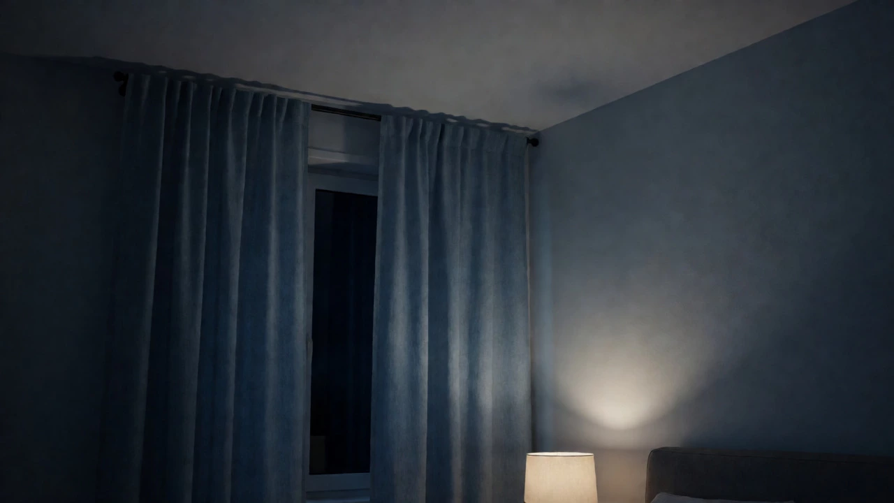
Pair with charcoal blackout lining to ensure total darkness for melatonin production.
You stare at the ceiling fan spinning in the dark, heart rate still hovering around 70 beats per minute. You tried lavender because a blog said it was relaxing. You tried beige because your friend’s apartment looked serene. Yet, you’re still awake at 2 AM, wondering if your brain is broken or if your bedroom walls are just screaming at you.
Here is the uncomfortable truth: there is no single "magic" color that works for everyone. But science points to a clear winner for the majority of people. If we look at physiological data-heart rate, blood pressure, and cortisol levels-the most calming color ever is blue. Specifically, not electric blue or navy, but soft, muted shades like sky blue, pale teal, or slate gray-blue. Why? Because blue lowers your sympathetic nervous system activity. It literally tells your body to chill out.
But wait. Before you run to the hardware store, consider this: I live in Auckland, where the light changes every ten minutes. A color that looks calming in London might feel cold and depressing here. Your curtains aren't just fabric; they are filters for light and mood. Let’s break down why blue wins, when it fails, and how to actually use it in your window treatments without making your room look like a hospital ward.
Why Blue Beats Green and Gray
People often argue for green. And honestly, green has its merits. It connects us to nature, which is inherently soothing. Studies from the University of British Columbia showed that blue environments stimulate creativity, while red stimulates attention. But for pure relaxation? Blue takes the crown.
Think about the ocean or a clear sky. These are universal symbols of calm. When you look at blue, your brain associates it with openness and stability. Green can sometimes feel active-it’s the color of growth, of energy. If you’re trying to sleep, you don’t want growth. You want stasis. You want the world to stop moving.
| Color Family | Heart Rate Effect | Best For | Potential Downside |
|---|---|---|---|
| Blue | Lowers significantly | Sleep, anxiety reduction | Can feel cold or sterile |
| Green | Mildly lowers | Freshness, balance | Can feel too active for deep rest |
| Gray | Neutral | Minimalism, focus | Can induce sadness if too dark |
| Lavender | Mildly lowers | Softness, romance | Often perceived as childish |
Gray is the other contender. It’s neutral. It doesn’t ask anything of you. But gray lacks warmth. In a bedroom, especially one with limited natural light, gray can make you feel isolated. Blue, however, has depth. It feels like a hug from the universe. It’s expansive. That’s why Indigo is a deep shade of blue that promotes introspection and deep sleep is gaining popularity in high-end interior design circles.
The Lighting Trap: Why Your Paint Chip Lied to You
Here is where most people mess up. They pick a paint chip under fluorescent store lights. Then they hang matching curtains in their north-facing bedroom. Suddenly, the "calming blue" looks like a dirty puddle. Why?
Lighting changes everything. In Auckland, we have strong southern light. This means our rooms get a lot of cool, bright daylight. If you use a very pale blue curtain, the sun will bleach it out until it looks white. If you use a dark blue, it might absorb too much heat and make the room feel heavy during summer afternoons.
You need to test your color choice at three times of day:
- Morning: How does it look with direct sunlight?
- Noon: How does it look when the light is harsh and overhead?
- Night: How does it look under warm yellow bulbs?
If you buy online, order samples. Hang them up. Leave them there for 48 hours. Watch how they change. A color that looks calming at 8 PM might look chaotic at 10 AM. Your goal is consistency. You want the same feeling of peace regardless of what time it is.
Curtain Materials Matter More Than Hue
You picked the perfect blue. But you bought cheap polyester curtains. Now they rustle loudly when you open them, and they trap static electricity. The visual calm is ruined by auditory chaos.
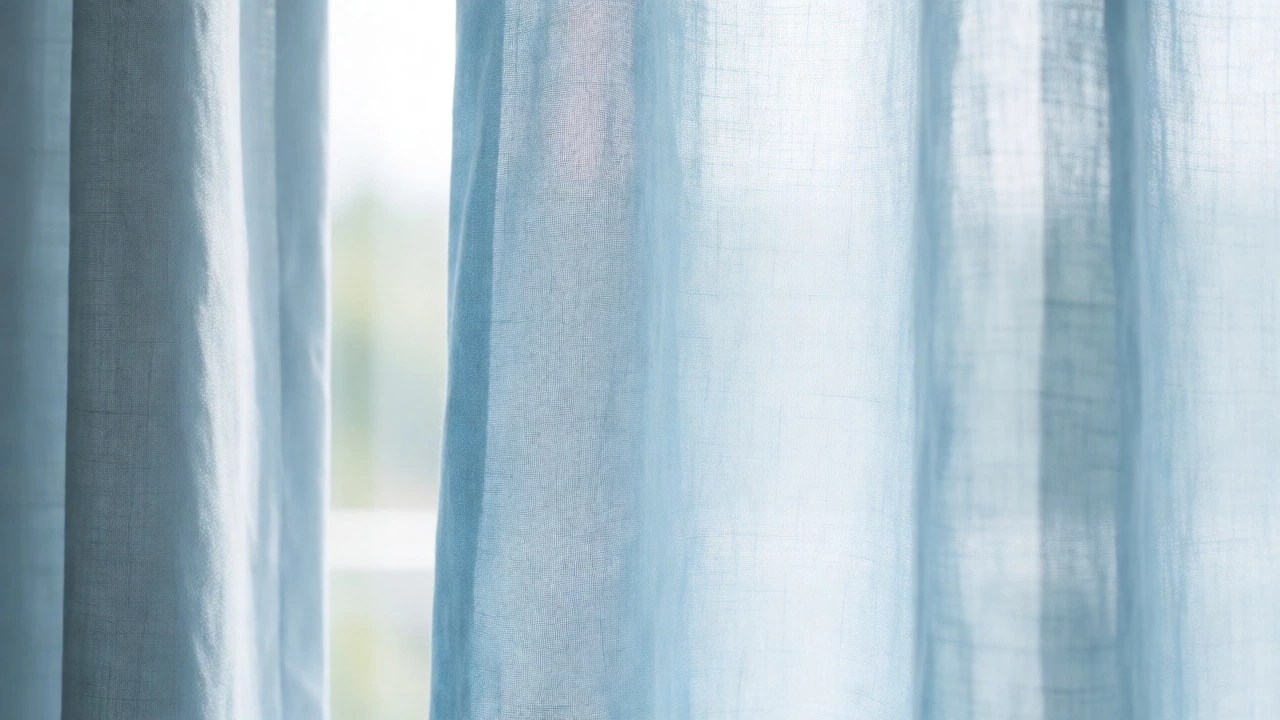
Texture plays a huge role in how calming a space feels. Rough textures can feel grounding, but sharp or synthetic textures can feel agitating. For a truly calming bedroom, go for natural fibers. Linen, cotton, or velvet. Linen breathes. It moves softly in the breeze. It absorbs sound better than thin synthetics. This reduces the sensory load on your brain. Fewer noises, less visual clutter, more sleep.
Consider Blackout Lining is a thick backing added to curtains to block light and reduce noise. Even if you love the color of your sheer curtains, adding a blackout layer ensures total darkness. Darkness triggers melatonin production. Light suppresses it. So, even if your color is calming, if light leaks through, your brain stays alert. Pair a soft blue outer curtain with a charcoal or black blackout liner. Best of both worlds.
Beyond Blue: Alternatives for Specific Personalities
Does blue make you sad? Some people associate blue with winter, isolation, or corporate offices. If that’s you, forcing yourself into a blue room won’t help. Here are alternatives based on psychological profiles:
The Nature Lover: Go for Sage Green. Not emerald, not lime. Sage. It’s dusty, muted, and earthy. It mimics the color of eucalyptus leaves or dried herbs. It feels organic. If you spend your weekends hiking in the Waitakere Ranges, sage green will feel like bringing the outdoors in. It reduces eye strain and feels restorative.
The Minimalist: Try Warm White or Cream. Pure white can be blinding. It reflects too much light. Cream has a tiny bit of yellow pigment. It softens the edges of the room. It feels cozy rather than clinical. Use textured fabrics like waffle weave or heavy linen to add interest without adding color noise.
The Romantic: Dusty Rose or Blush. Pink isn’t just for little girls. Muted pinks contain red (energy) but are diluted enough to be soothing. They promote feelings of safety and nurturing. Avoid hot pink or magenta. Stick to tones that look like dried flowers.
Practical Curtain Ideas for a Calmer Bedroom
So, you’ve chosen your color. How do you install it to maximize calm? Here are three setups that work well in real homes, not just magazines.
1. The Floor-to-Ceiling Illusion
Mount your curtain rod close to the ceiling, not just above the window frame. Let the fabric pool slightly on the floor. This draws the eye upward, making the room feel taller and airier. Tall spaces feel less claustrophobic, which helps with anxiety. Use a soft blue linen here. The vertical lines guide your gaze gently, promoting a sense of flow.
2. The Layered Approach
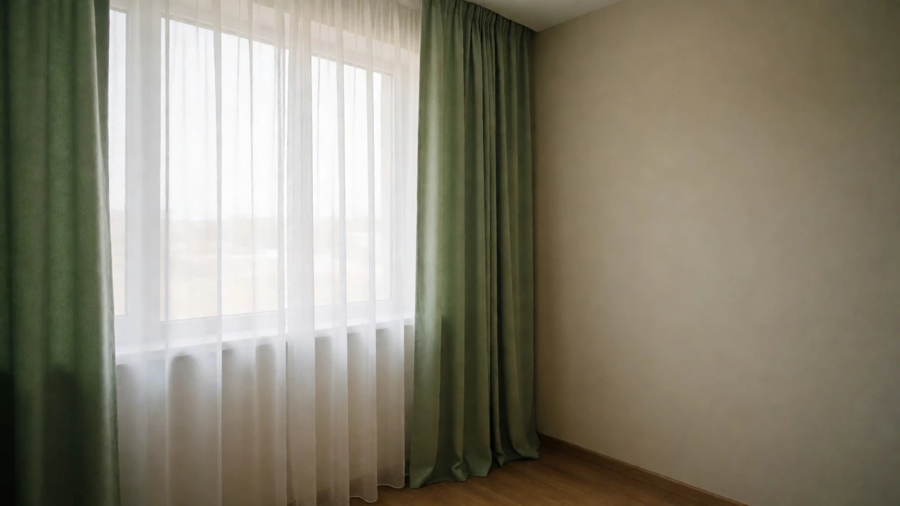
Use two layers. Sheers in a pale cream or white, and drapes in your calming color (blue or sage). During the day, pull back the drapes and let the sheers filter the light. This creates a diffused, dreamy glow. At night, close the drapes for privacy and darkness. This gives you control over your environment. Control equals calm.
3. The Accent Pop
If you’re scared to commit to full blue curtains, keep your walls neutral (white or beige) and use blue only in the curtains. Or vice versa. Don’t compete. If your walls are blue, make your curtains a lighter shade of the same family. Monochromatic schemes are easier for the brain to process. Less contrast means less cognitive effort. Your brain doesn’t have to work hard to interpret the space. It just rests.
Avoid These Common Mistakes
I’ve seen so many people ruin a calming vibe with simple errors. Here is what to avoid:
- High Contrast Patterns: Busy florals or geometric prints in your calming color can negate the effect. The pattern adds visual noise. Stick to solid colors or subtle tonal textures.
- Wrong Undertones: A blue with a purple undertone can feel spooky. A blue with a green undertone can feel sickly. Look for blues with gray or brown undertones for maximum serenity.
- Ignoring Room Size: Dark colors shrink a room. If you have a tiny bedroom, a dark navy curtain might make it feel like a cave. Opt for lighter pastels or use mirrors to bounce light.
Remember, the goal isn't to follow a rulebook. It's to create a space where your nervous system downshifts. Start with blue. Test it. Adjust for your light. Choose natural fabrics. If it feels right, stick with it. If not, try sage. There is no shame in changing your mind. Your home should serve you, not the other way around.
Frequently Asked Questions
Is blue really the most calming color according to science?
Yes, multiple studies indicate that blue lowers heart rate and blood pressure more effectively than other colors. However, individual reactions vary. While blue is statistically the most calming for the general population, personal associations play a significant role. If you have negative memories associated with blue, it may not work for you.
What shade of blue is best for bedrooms?
Muted, low-saturation blues are best. Think sky blue, slate, or pale teal. Avoid bright electric blues or deep navies unless you have a large room with plenty of light. Soft blues reflect light gently and promote a sense of spaciousness and tranquility.
Do curtains affect sleep quality?
Absolutely. Curtains block external light sources like streetlights and early morning sun, which disrupt melatonin production. Blackout curtains are particularly effective. Additionally, the color and texture of the curtains influence your psychological state before bed, helping you wind down.
Can gray be calming too?
Yes, gray can be calming, especially warm grays with beige or taupe undertones. Cool grays can feel sterile or depressing. To make gray calming, pair it with warm lighting and textured fabrics to add coziness. It works well for minimalists who prefer neutrality over color.
How do I choose the right curtain color for my wall color?
For a calming effect, choose a curtain color that is either a lighter shade of your wall color or a complementary neutral. Monochromatic schemes are easiest on the eyes. If your walls are white, any calming pastel works. If your walls are colored, ensure the curtains don't clash or create high-contrast visual noise.